Clear UK
Clear UK is an organisation dedicated to reforming the laws around cannabis and proving the medicine can be a tool to help people. I handled the UX / UI and my friend would handle the development.
User Journey
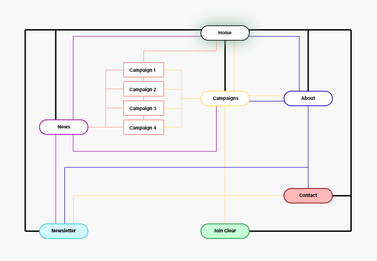
The first thing I did when approaching the redesign was figure out the organisation's goals and create a user journey that would allow sharper focus in figuring out what the end point for a user would be.
Once I had the journey laid out I went ahead to create a flow map of the new website. I analysed the current layout and tightened it up, so the content was easier to navigate to.
Logo
The logo design was pretty simple here. I took their existing logo and remade it as a vector illustration. I then placed it into a circle and cut it out.
Styleguide
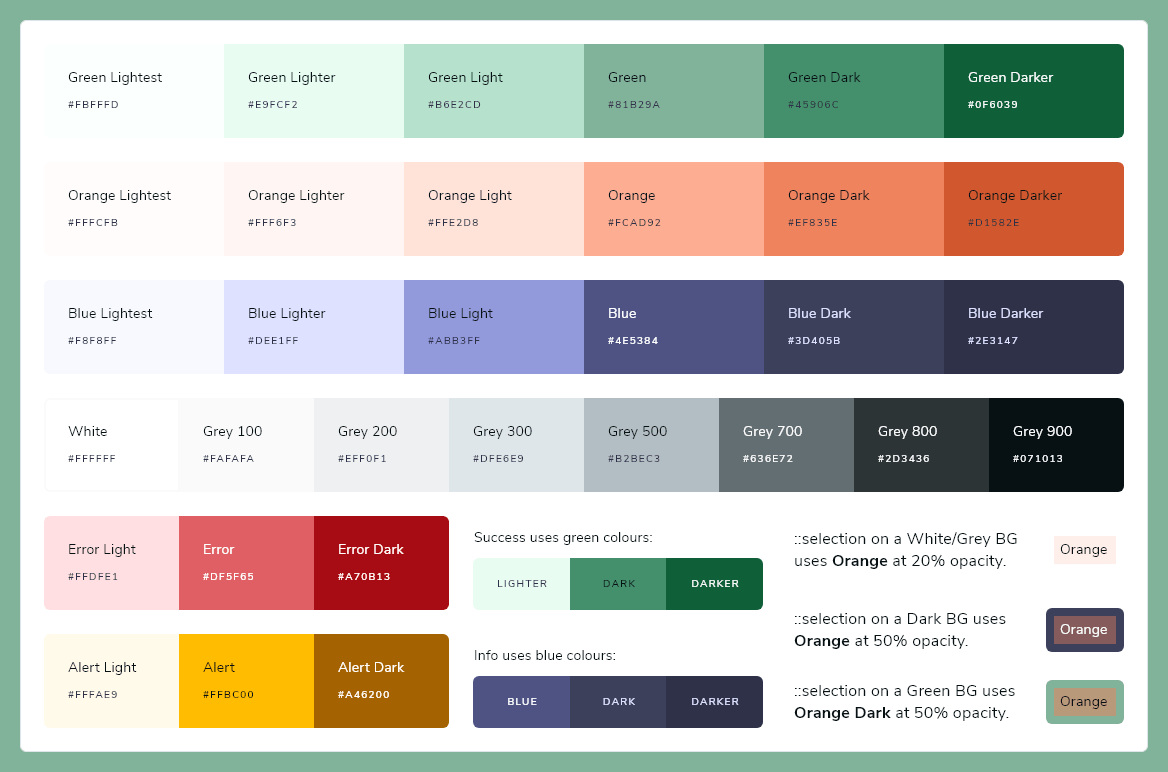
Being an organisation focused around the legalisation of marijuana, I found a green primary colour to be fitting. I then based the other colours used off this - orange being complimentary and the dark blue colour to be contrasting.
Using a green as a background colour presented some challenges in accessibility, so I made sure the text that showed on the green background would meet the AAA accessibility requirements.
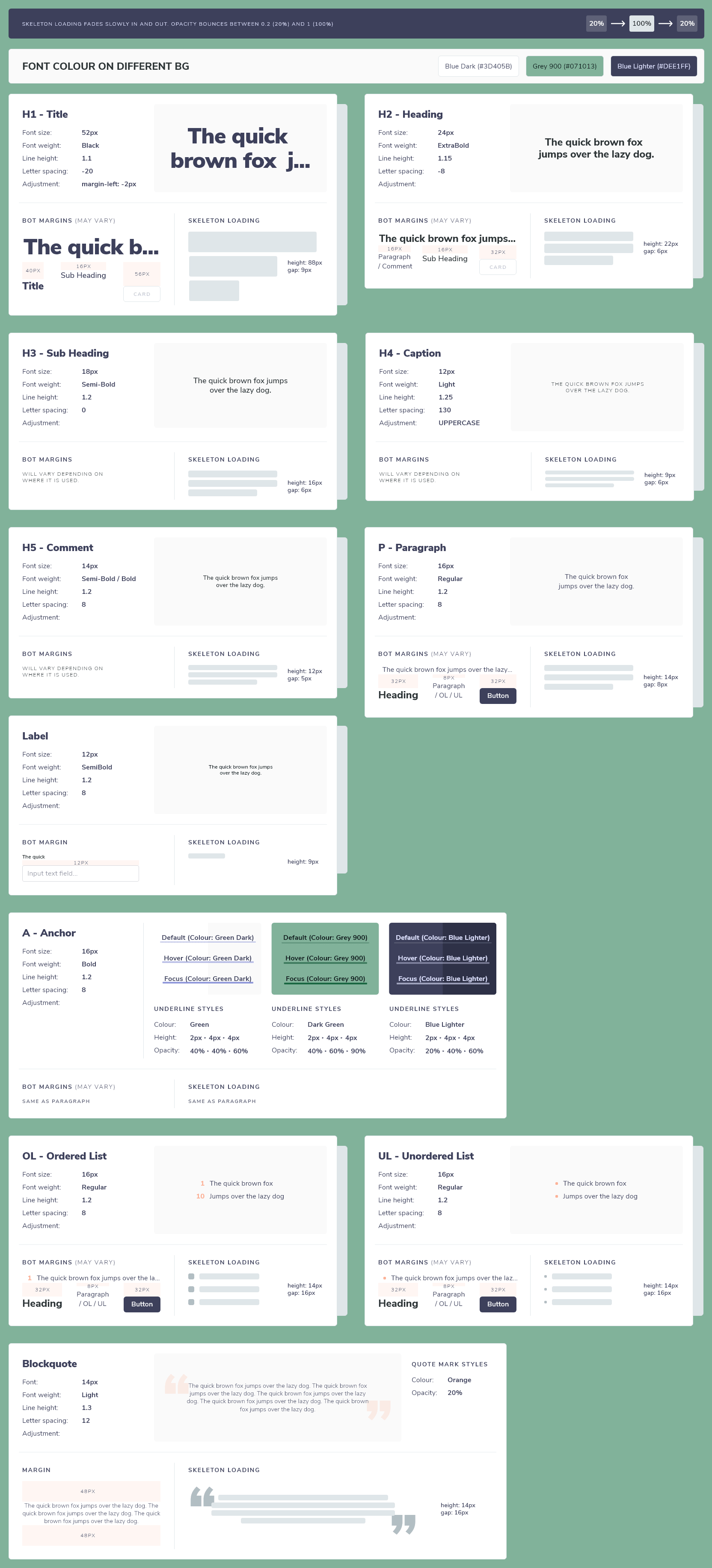
There is only one font used in this project - Nunito Sans. I used size and weight to determine the hierarchy of the typography to make each heading and content distinguishable.
I also provided an extensive styling guide for each option to help in the development of the styleguide.
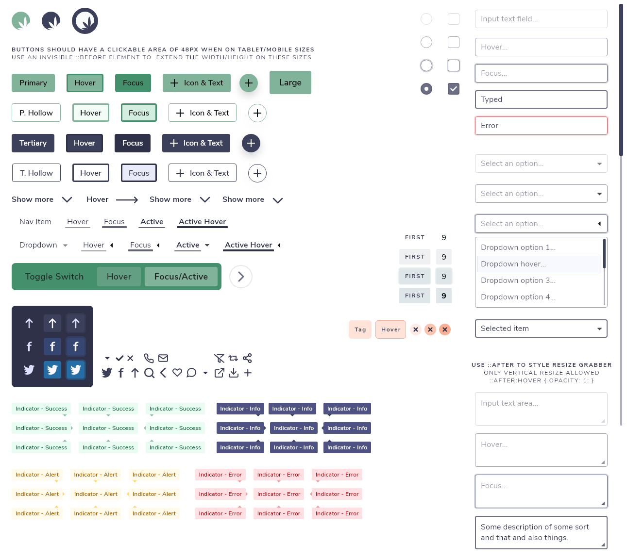
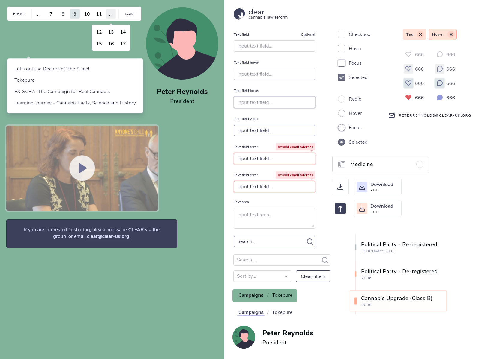
Components
Components were designed with an atomic design structure. Atoms would be present in Molecules, and so on. Using my knowledge of CSS and SCSS I was able to show different states for each, and even add comments that would help in development where necessary.
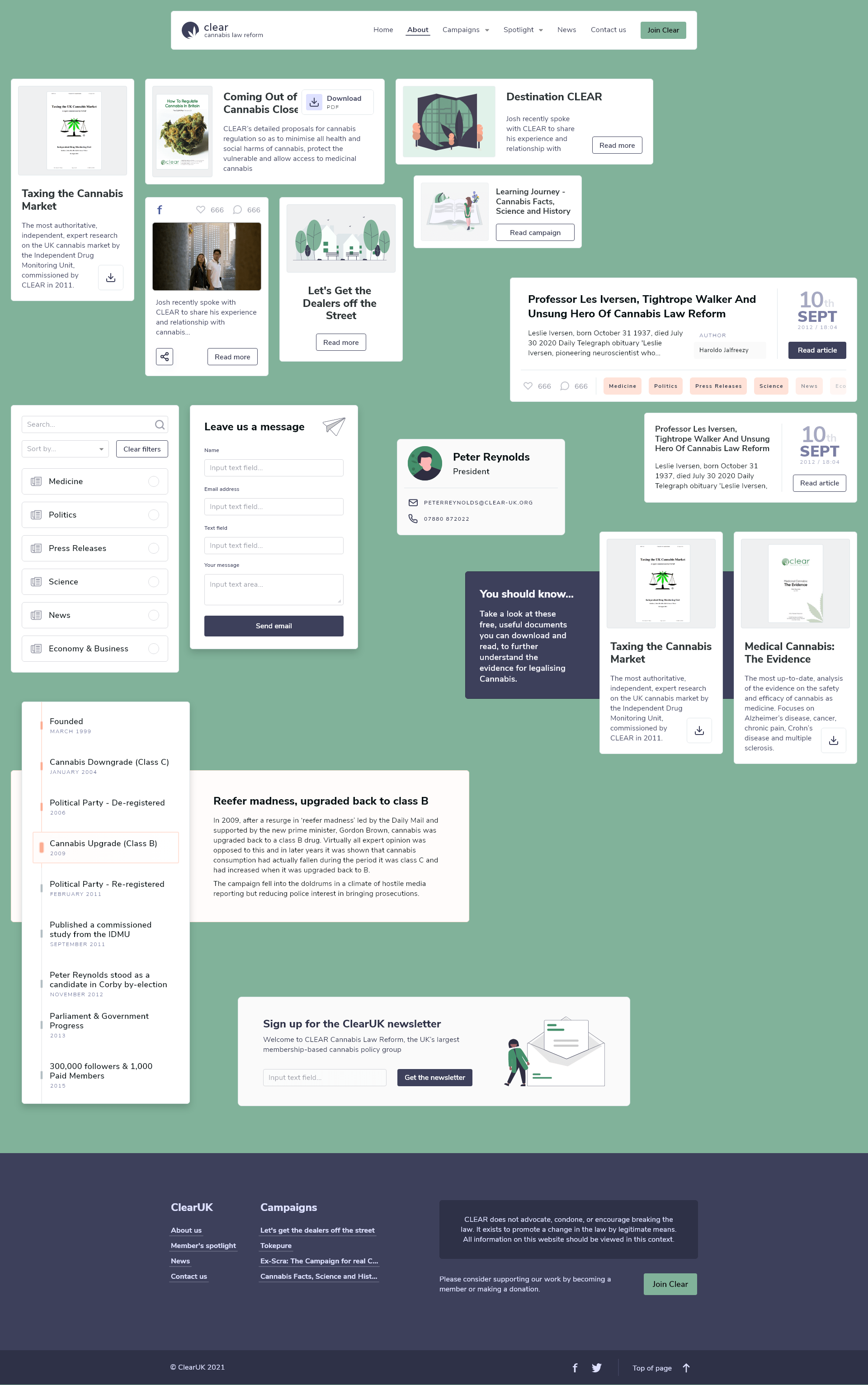
Design
In the design process I had an idea that the content would be laid out over the primary colour as cards, to create a sense of depth - and just to try something different! The website was to be built in react, so I thought the idea would work well using a component based system.
You can view and interact with the Adobe XD flow prototype I created using this link here. Or see the final screens presented below.
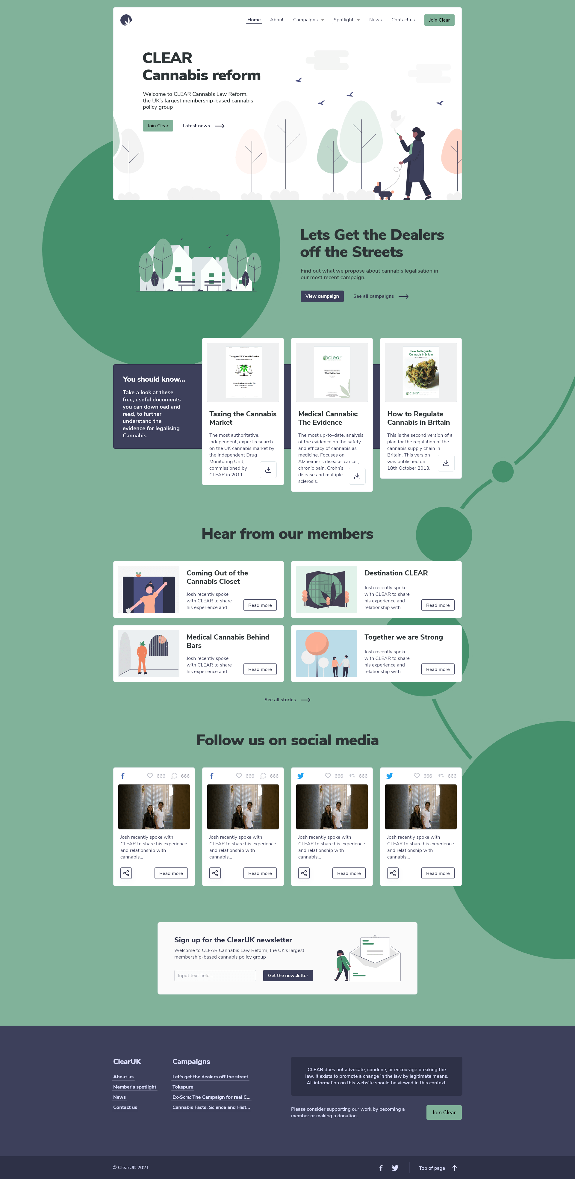
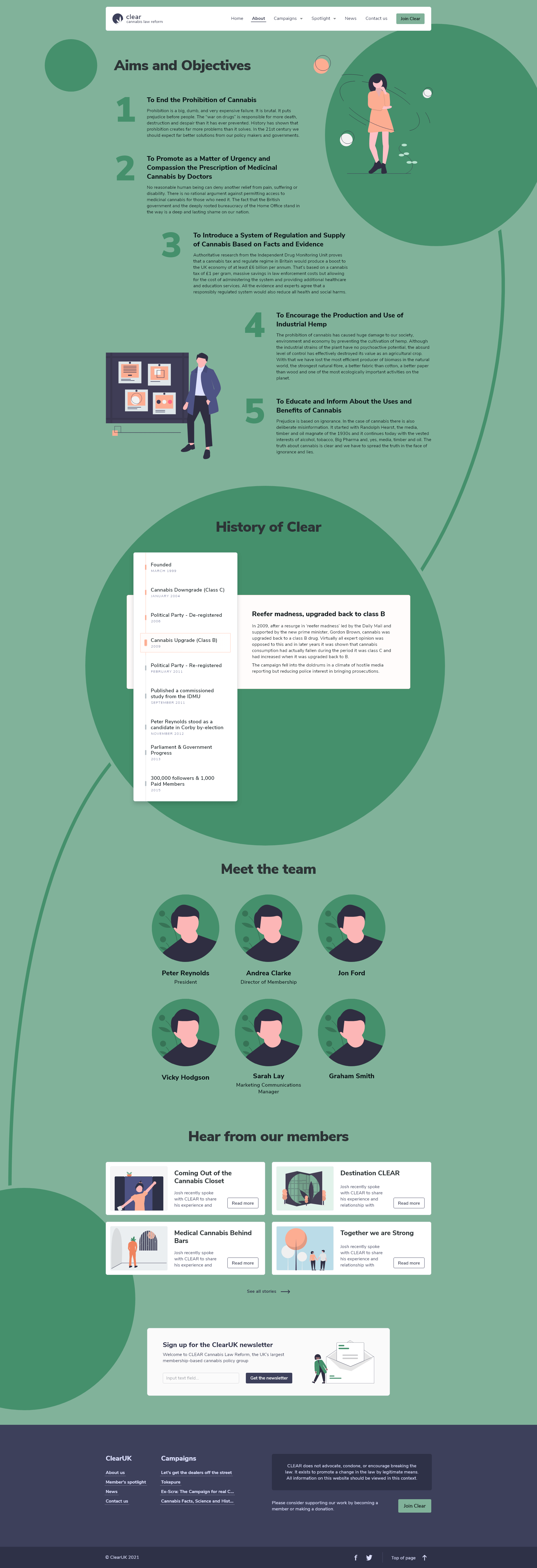
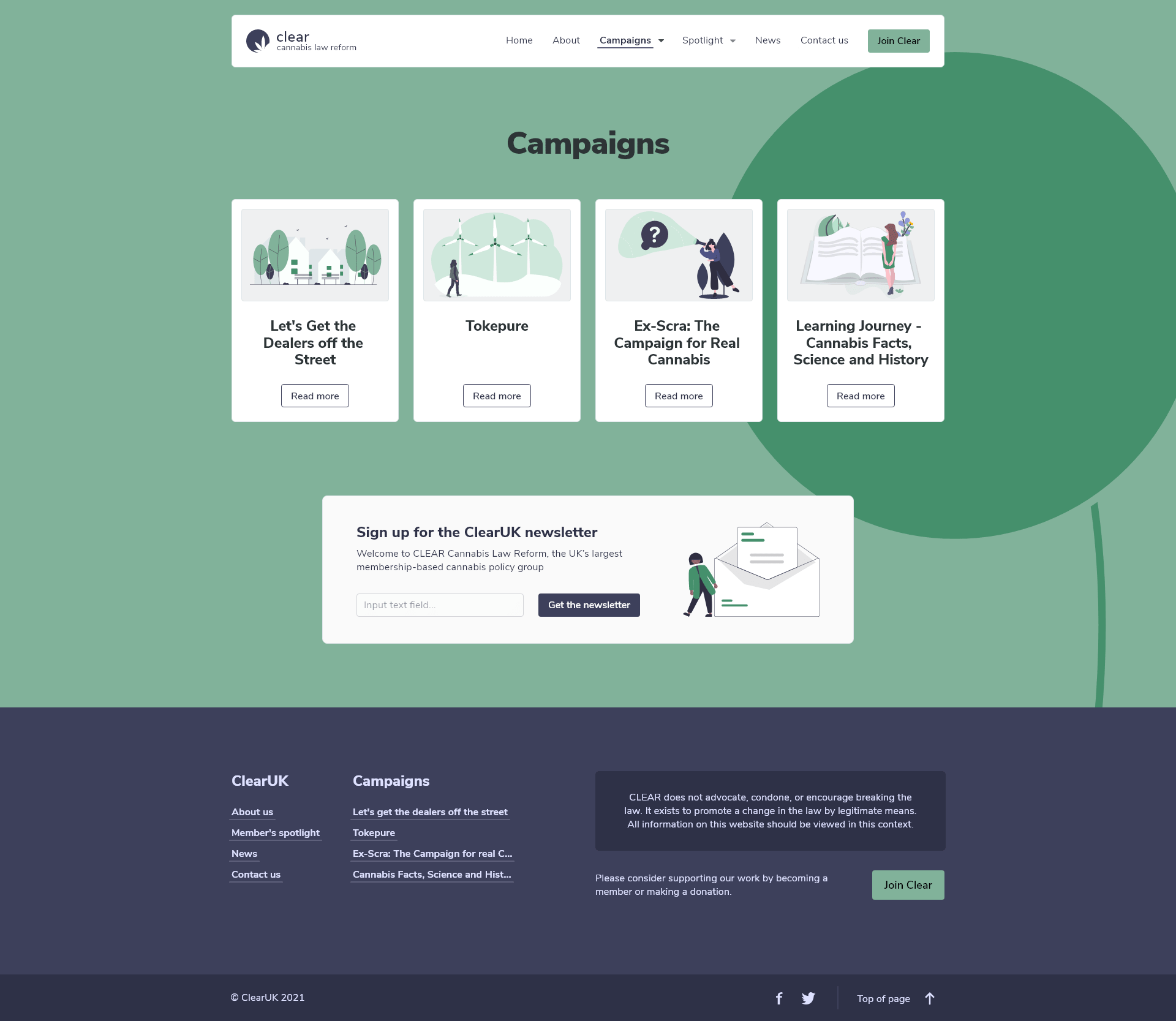
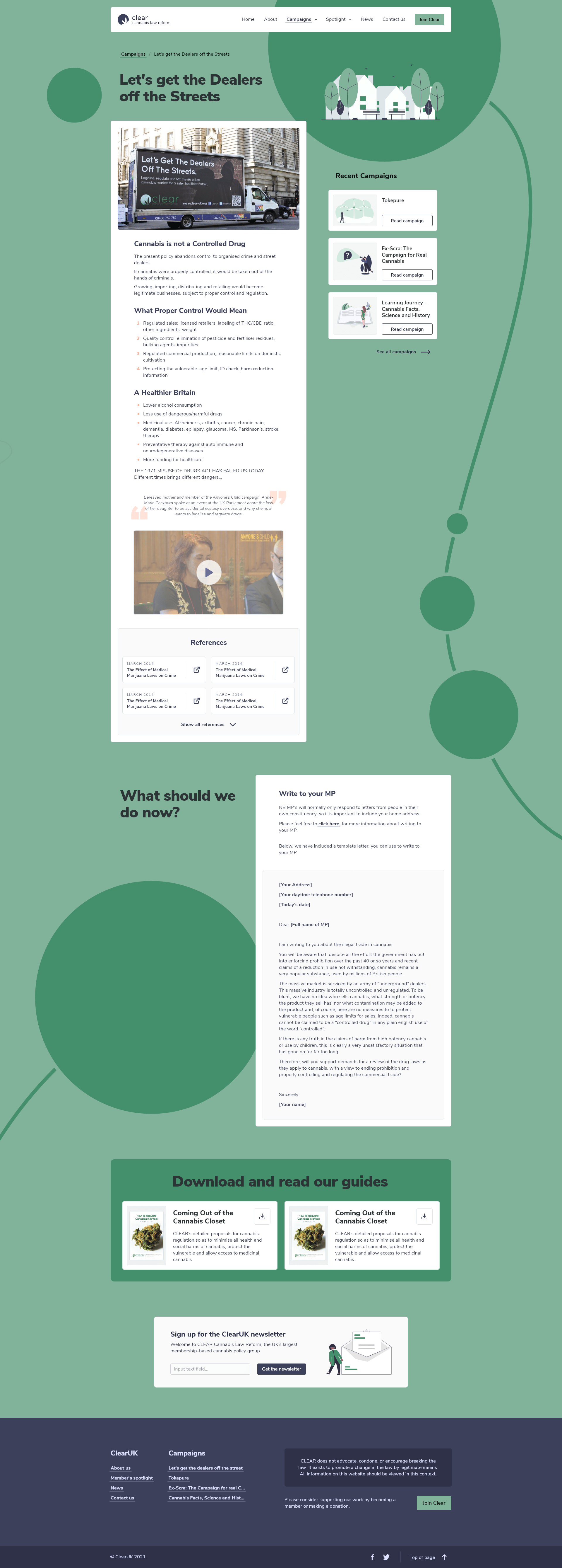
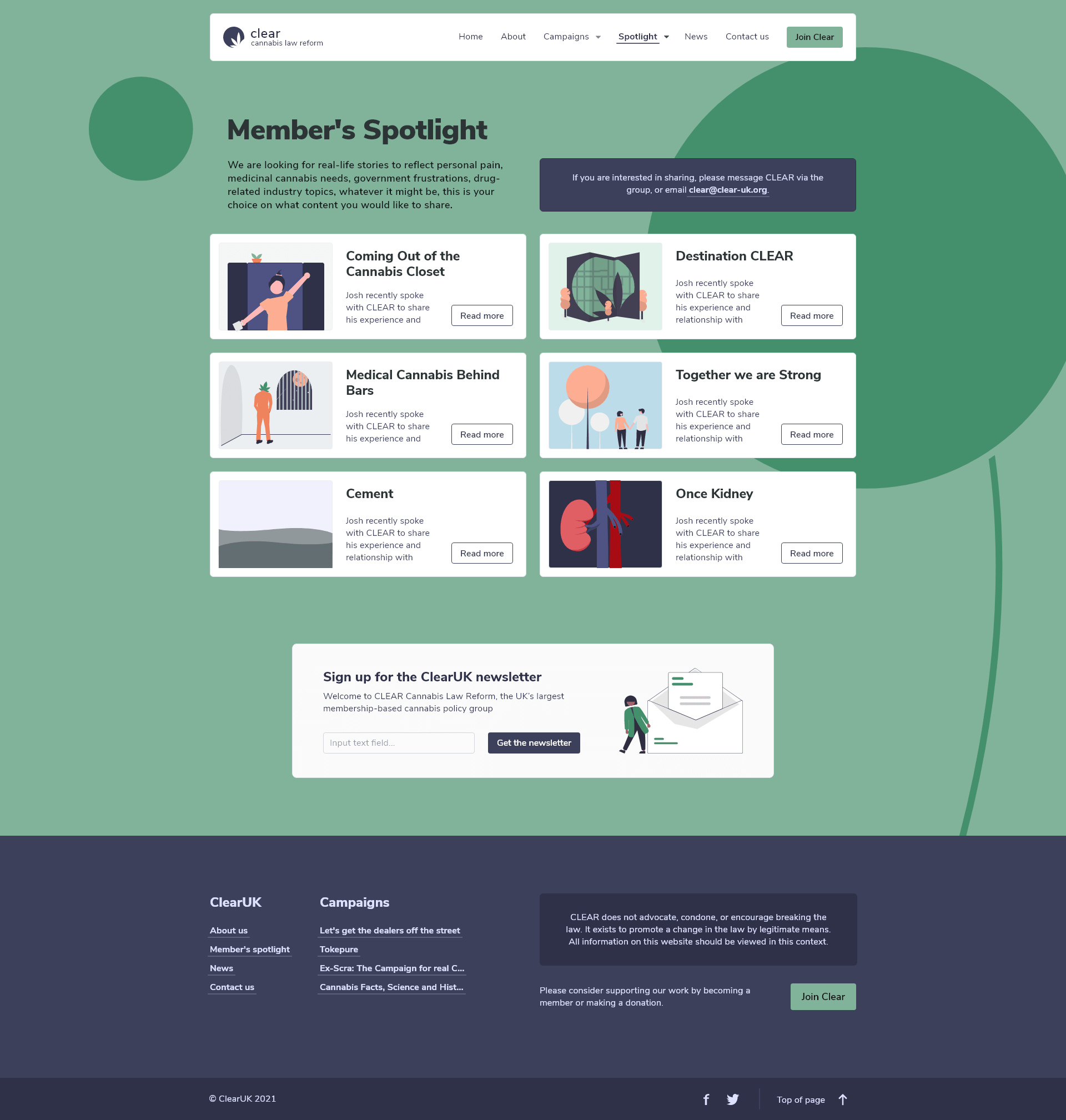
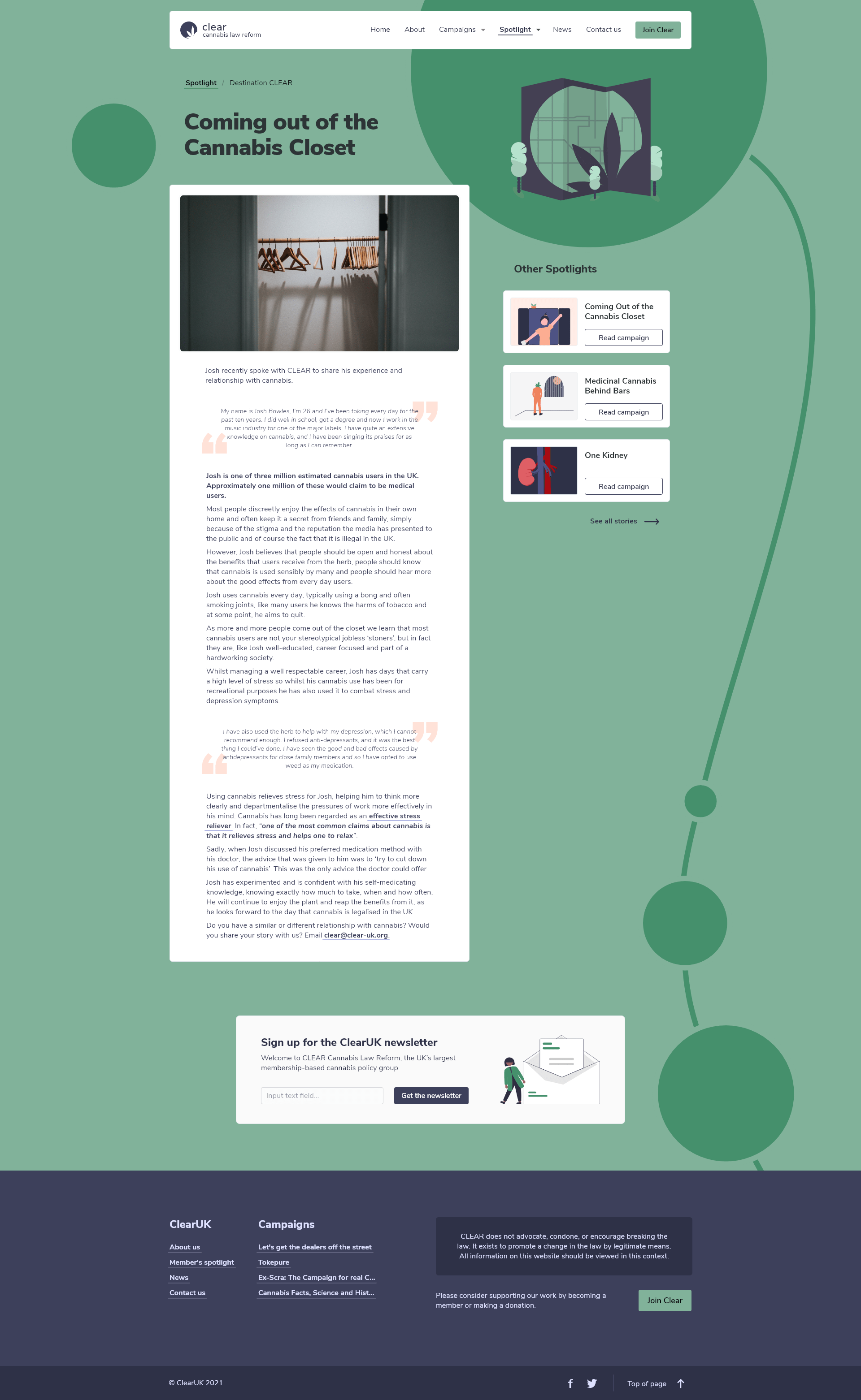
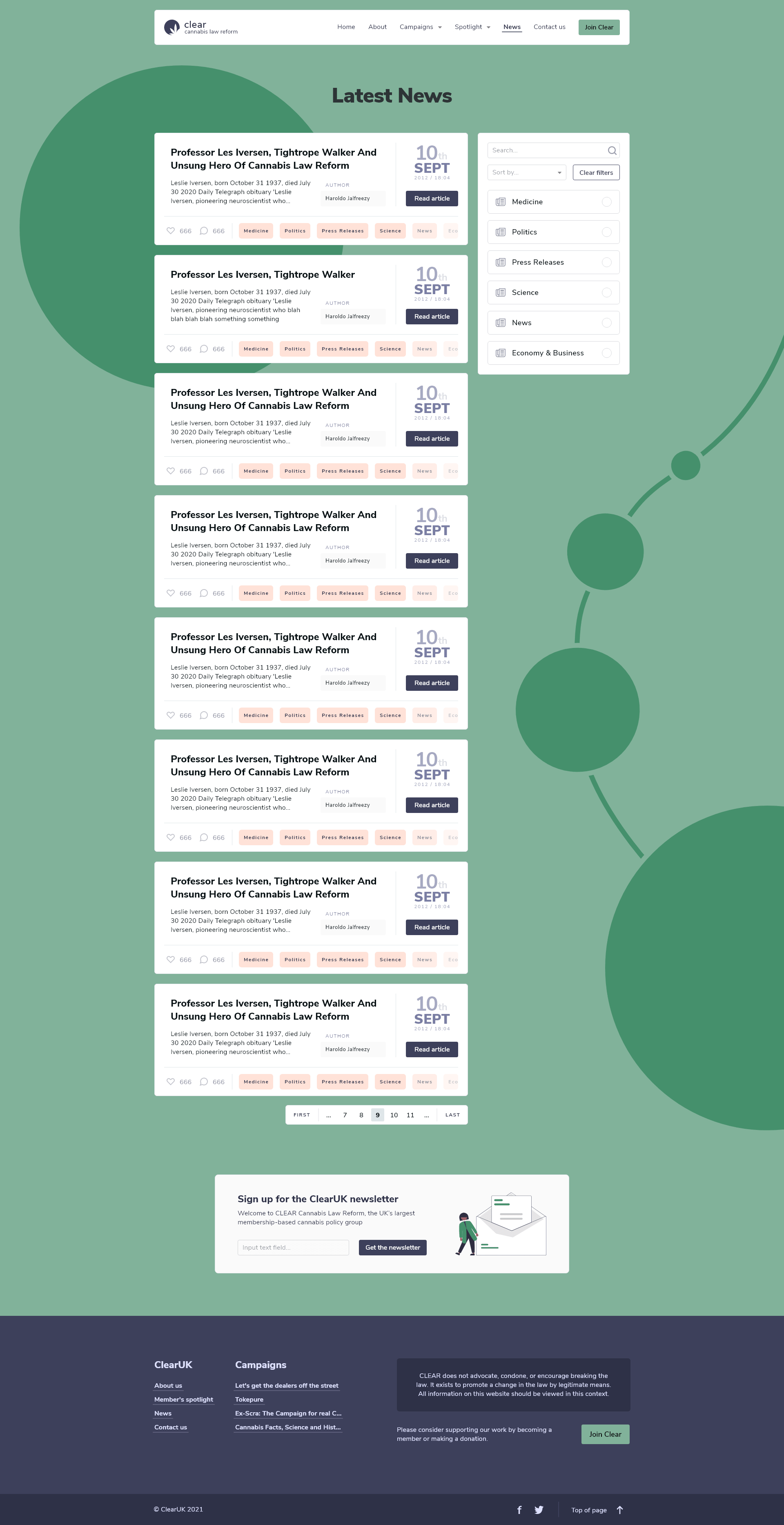
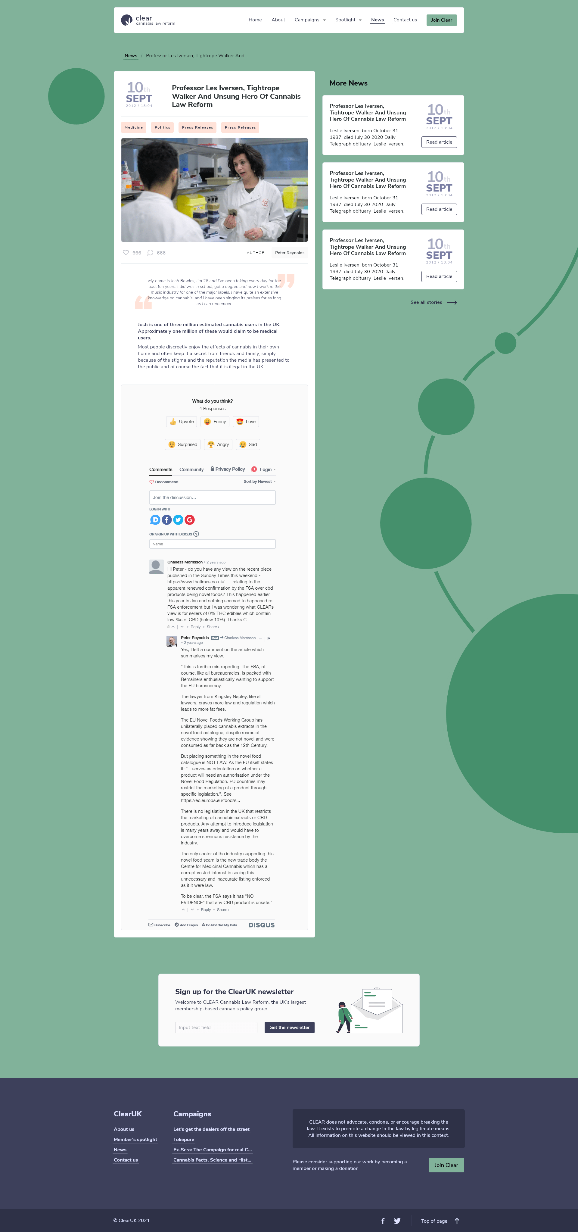
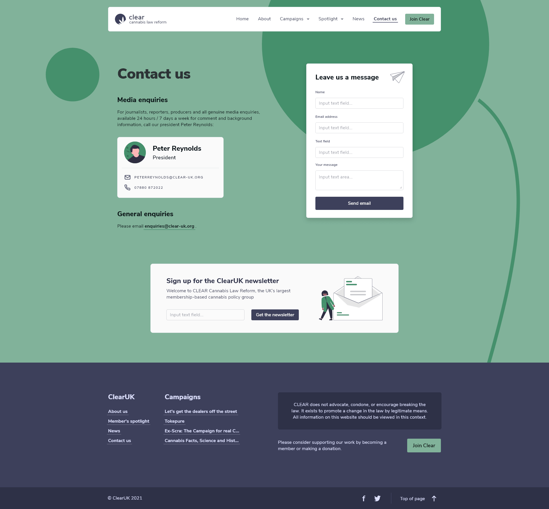
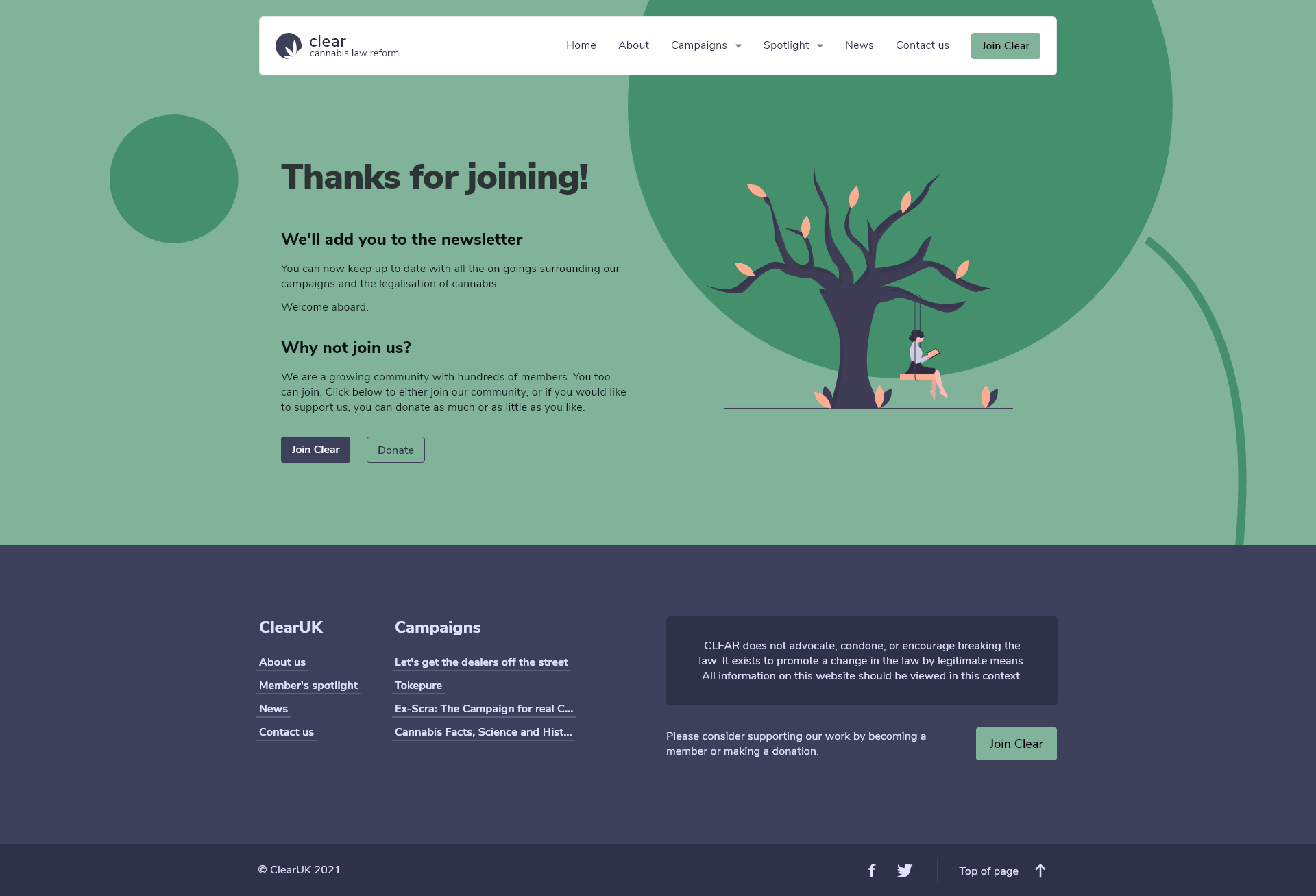
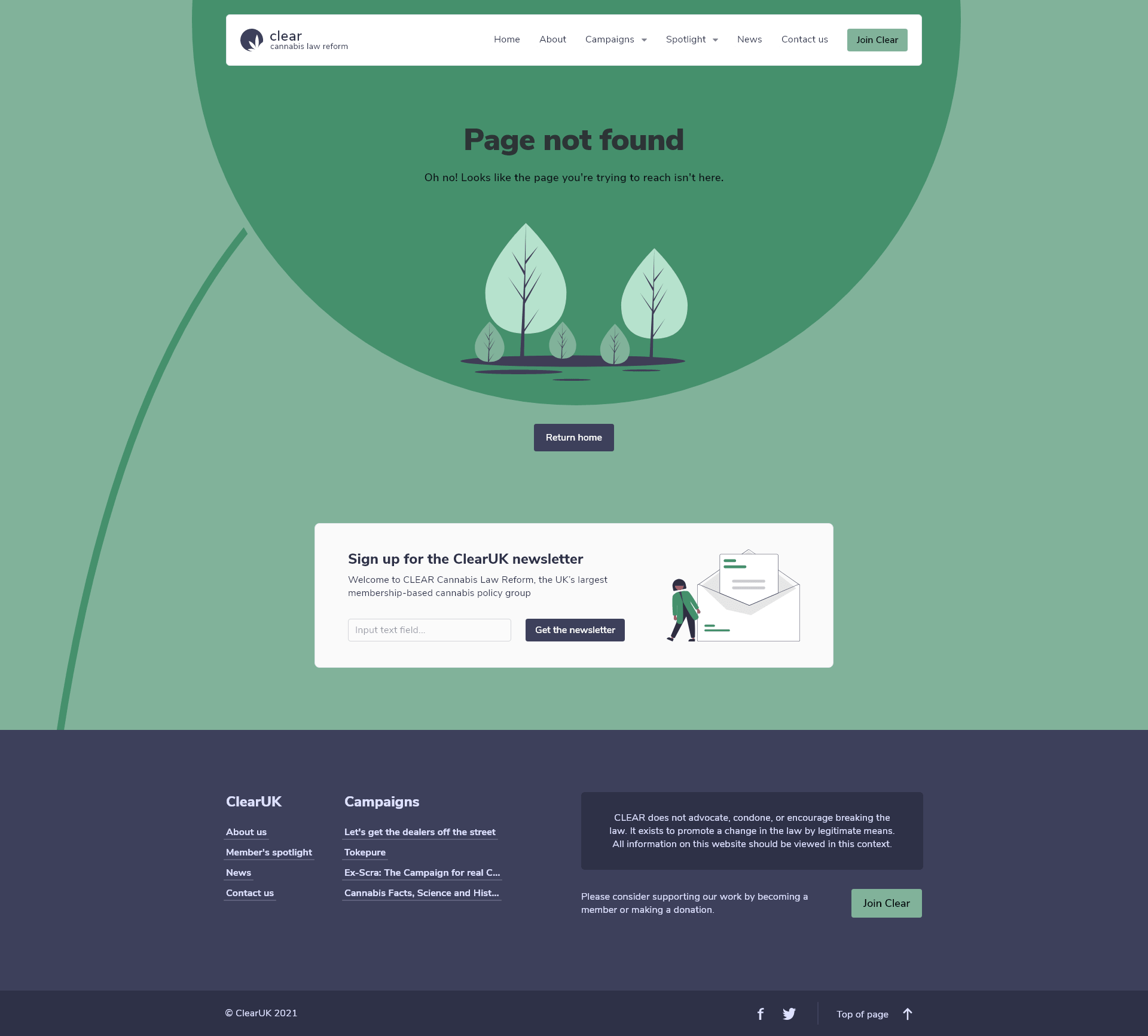
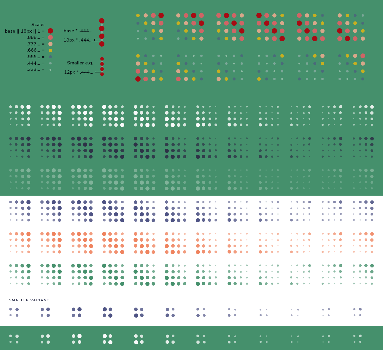
The circles in the background use the golden ratio to set their sizes. The largest circle has a fixed height and width, and the subsequent circles follow the formula for resizing.