North Property Group
I worked with North Property Group for only a couple of months, but I managed to help rebrand them and set up email and print templates for use going forwards.
Logo
Their original logo was becoming slightly outdated. With the company growing and evolving, the logo and brand needed to keep up.
The new logo has sharp cutting edges, showing the world they are modern and reliable. The 'N' and 'P' from the company name form the outline of the icon shape and the pointy right angles are to represent a property.
Now the brand has a unique and distinct glance value icon for the logo that can be carried across the branding.
Branding
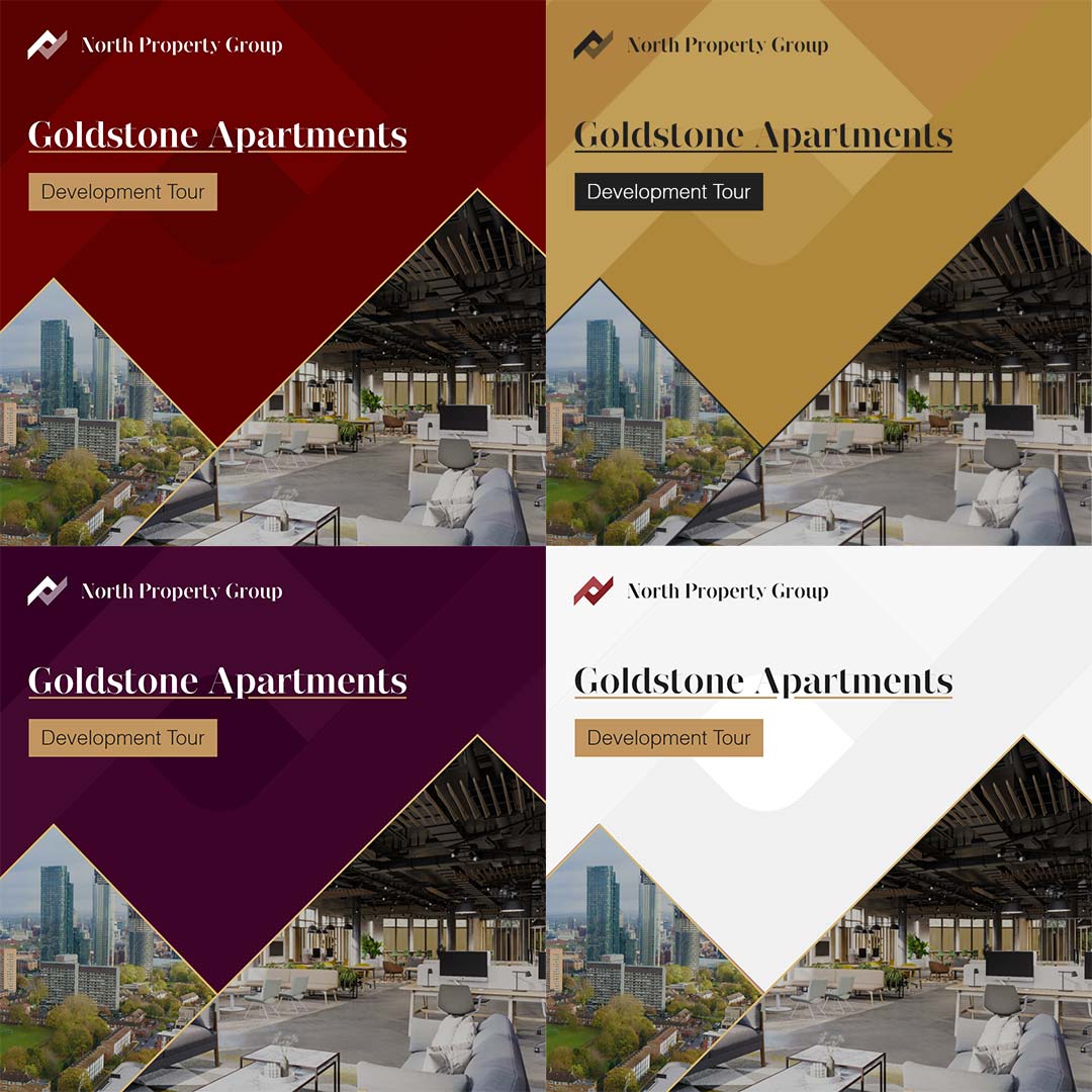
The logo can be tesselate symetrically with itself to work as background assets, breaking up a potentially boring plain background and adding depth.
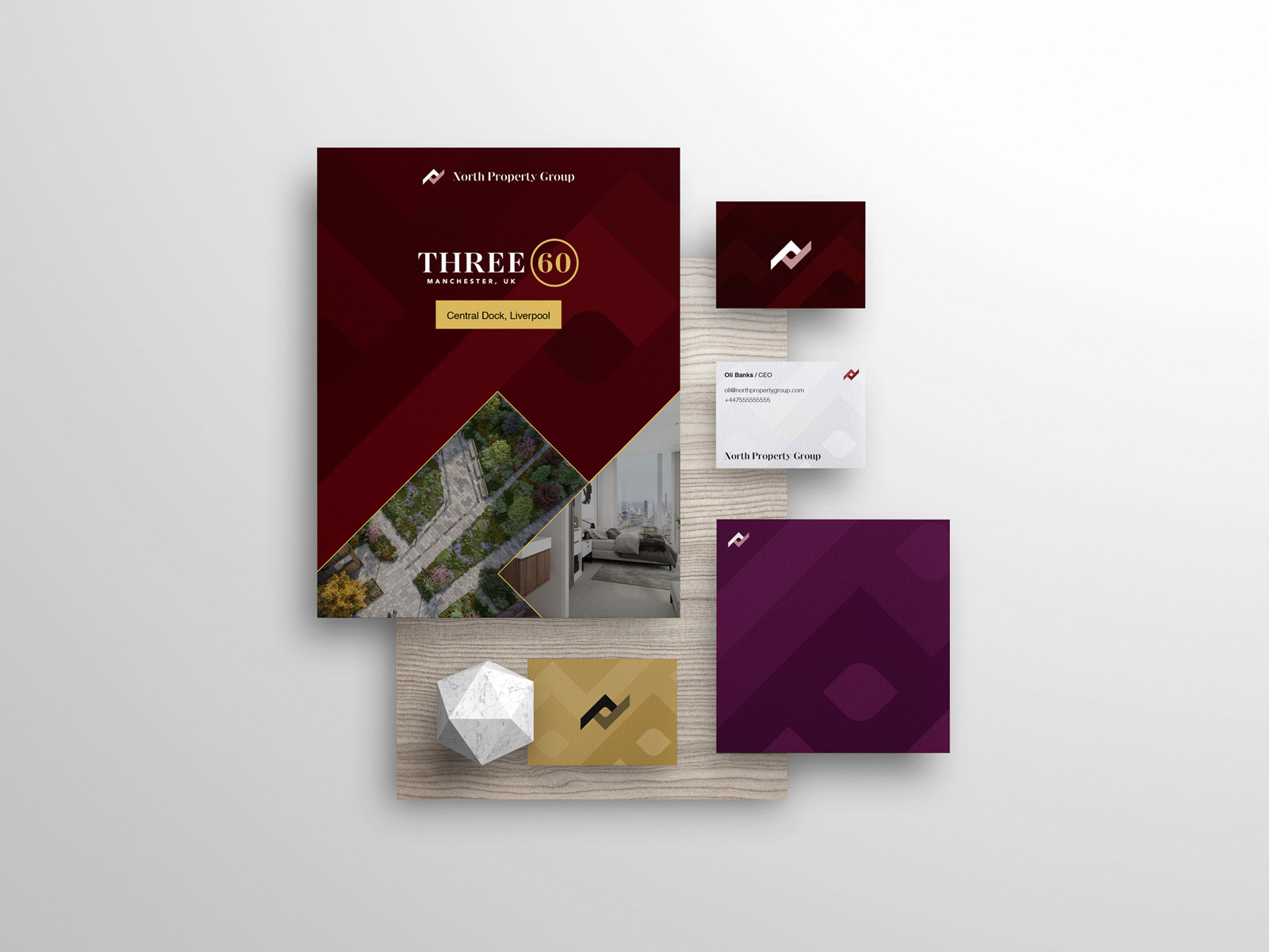
The company works with different categories of customers, requiring different levels of expertise. An introduction of a new purple colour would allow the company to visually break the departments and allow each to be unique and recognisable from a glance.
Email Template
The final project I completed for North Property Group was a pardot email template. I completed the design using Adobe XD, and later developed templates in MJML - a library for making email development less of a nightmare.
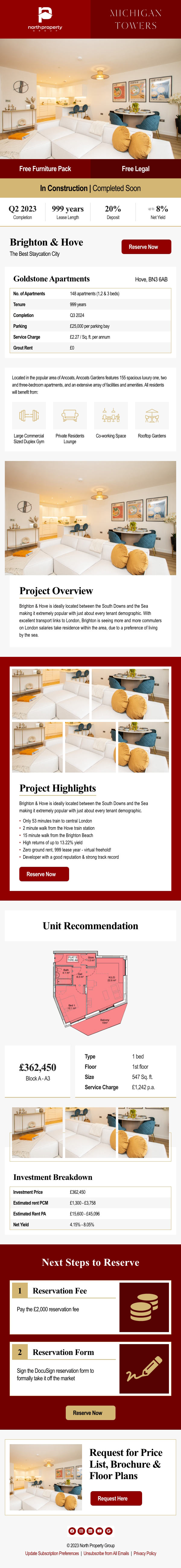
Once the development was complete and responsiveness was tested it was time to add in the Pardot meta tags and import it efficiently into Pardot. Now they can clone a master template and reduce modules as needed for the creation of what ever email they desire.