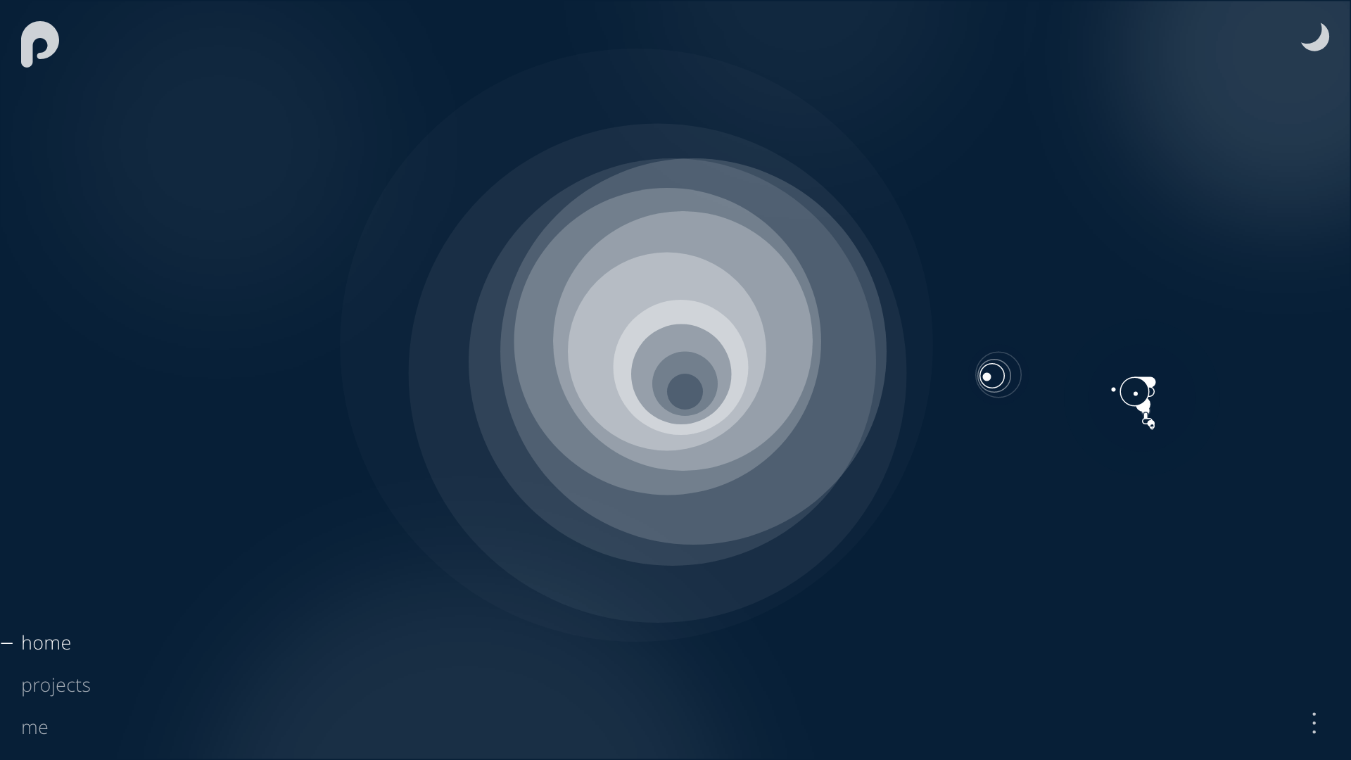
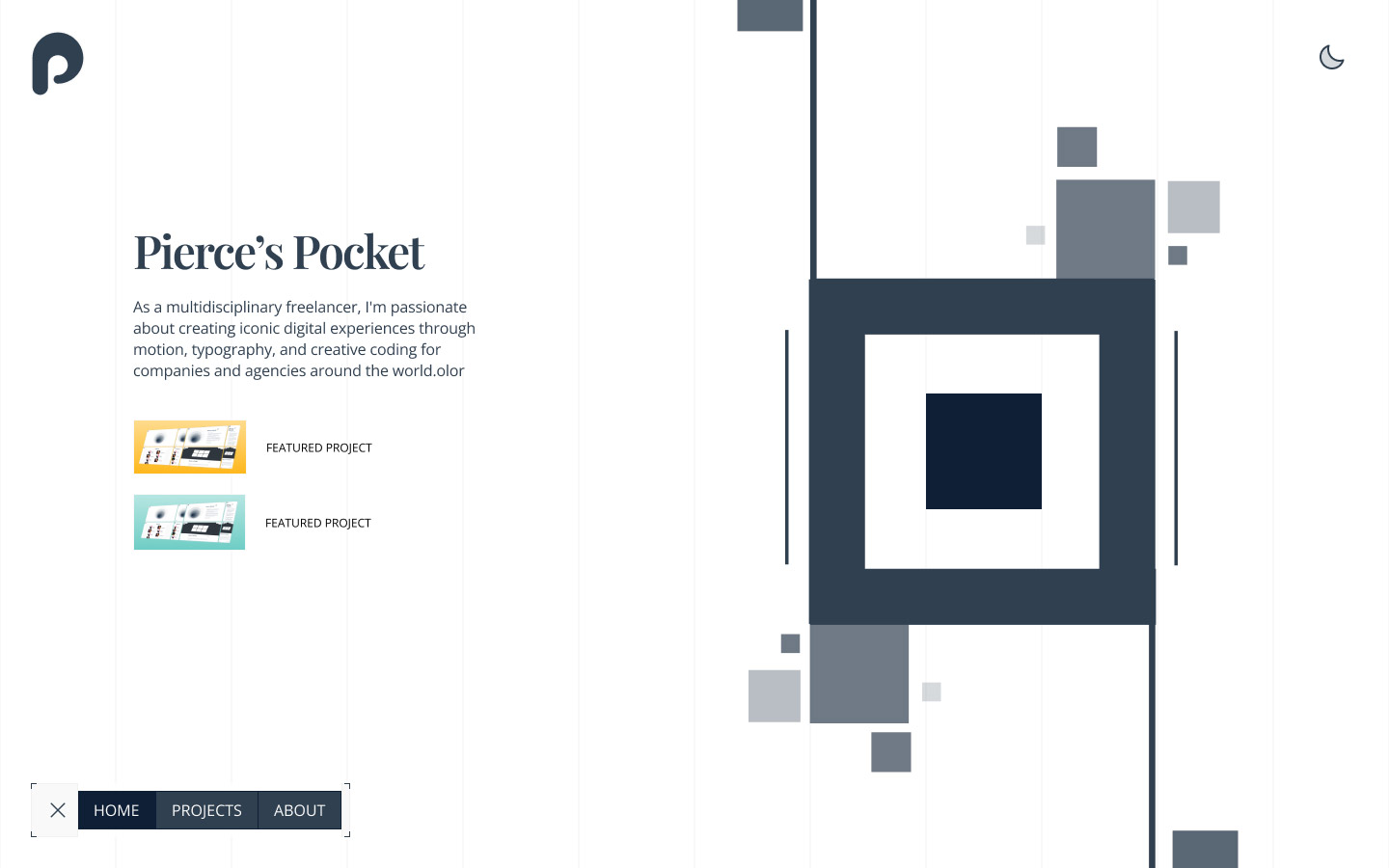
Pierce's Pocket
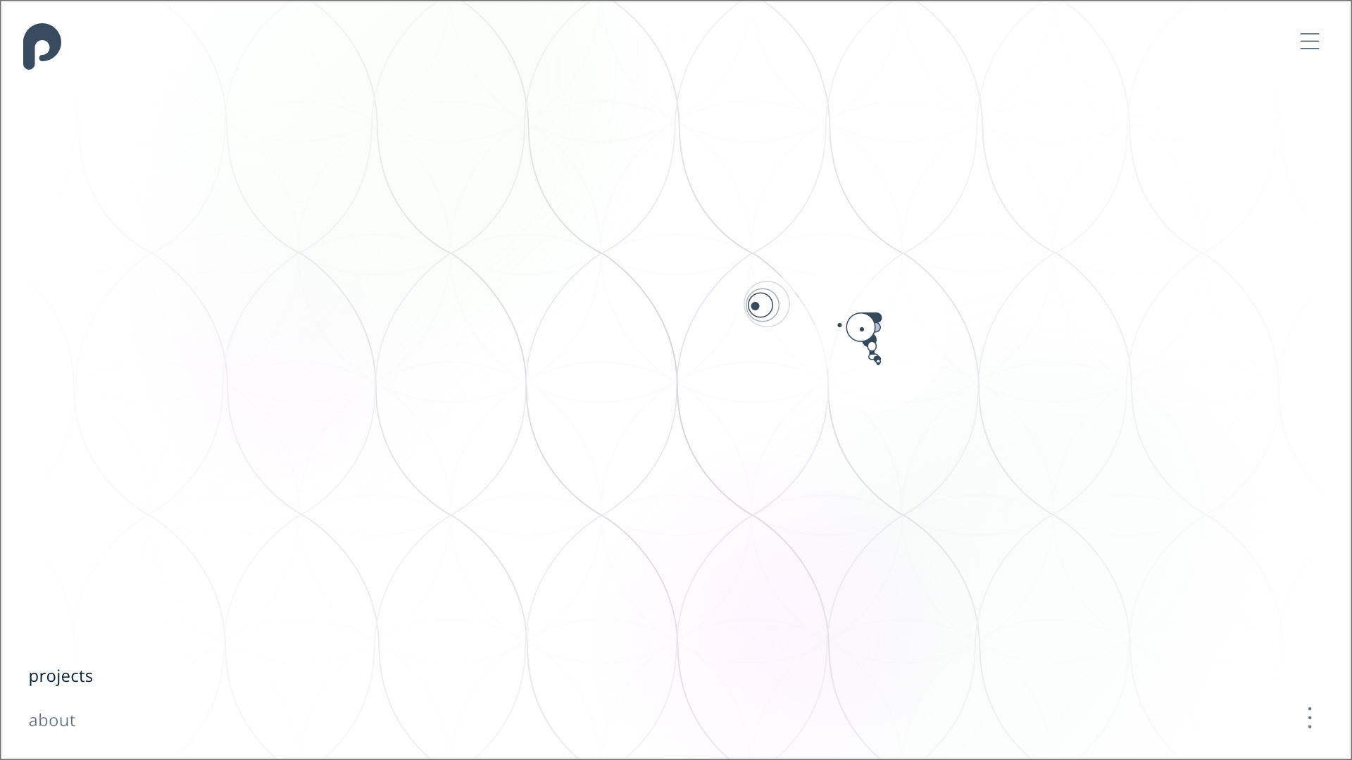
Welcome to Pierce’s Pocket! I designed and developed this website as a home for my work. The style is minimal & clean. The work I produce needs to be easily accessible, whilst being pleasant to look at.
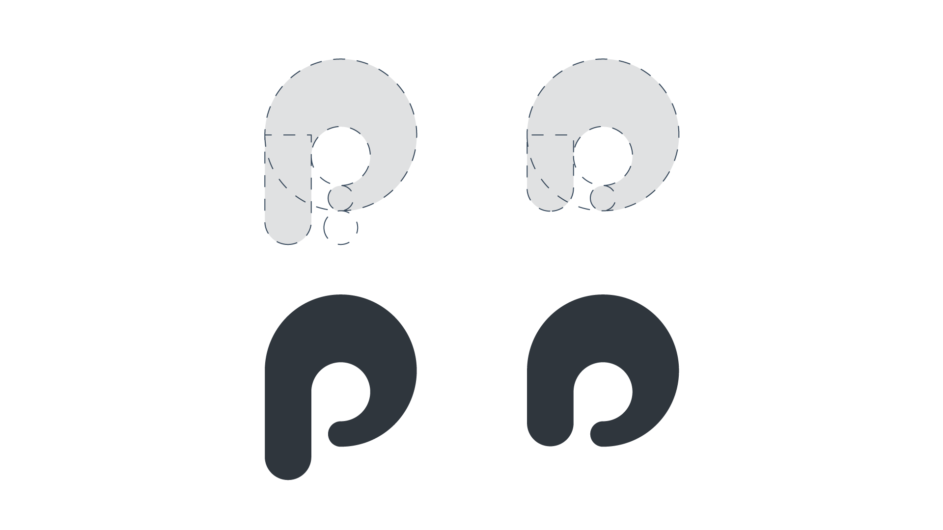
Logo
When designing the logo I had two things in mind. I wanted it to look like it was cutout of the page, and that two "p's" were present - one inside the other.
The shortened logo is used on pages where the overlayed panels are shrunk - just like this page you are on now!
Styleguide
The style is simple but effective. Less is always more. I opted for a monochrome aesthetic, leaving space for images and slight accents to bring in the colours, which adds the spice!
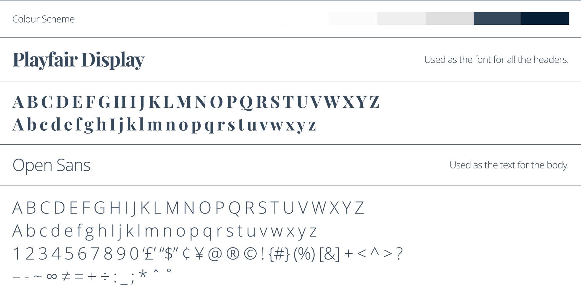
Playfair Display was used in earlier iterations, but I have recently opted for a more modern look to blend in with my new brand direction.
First Iteration
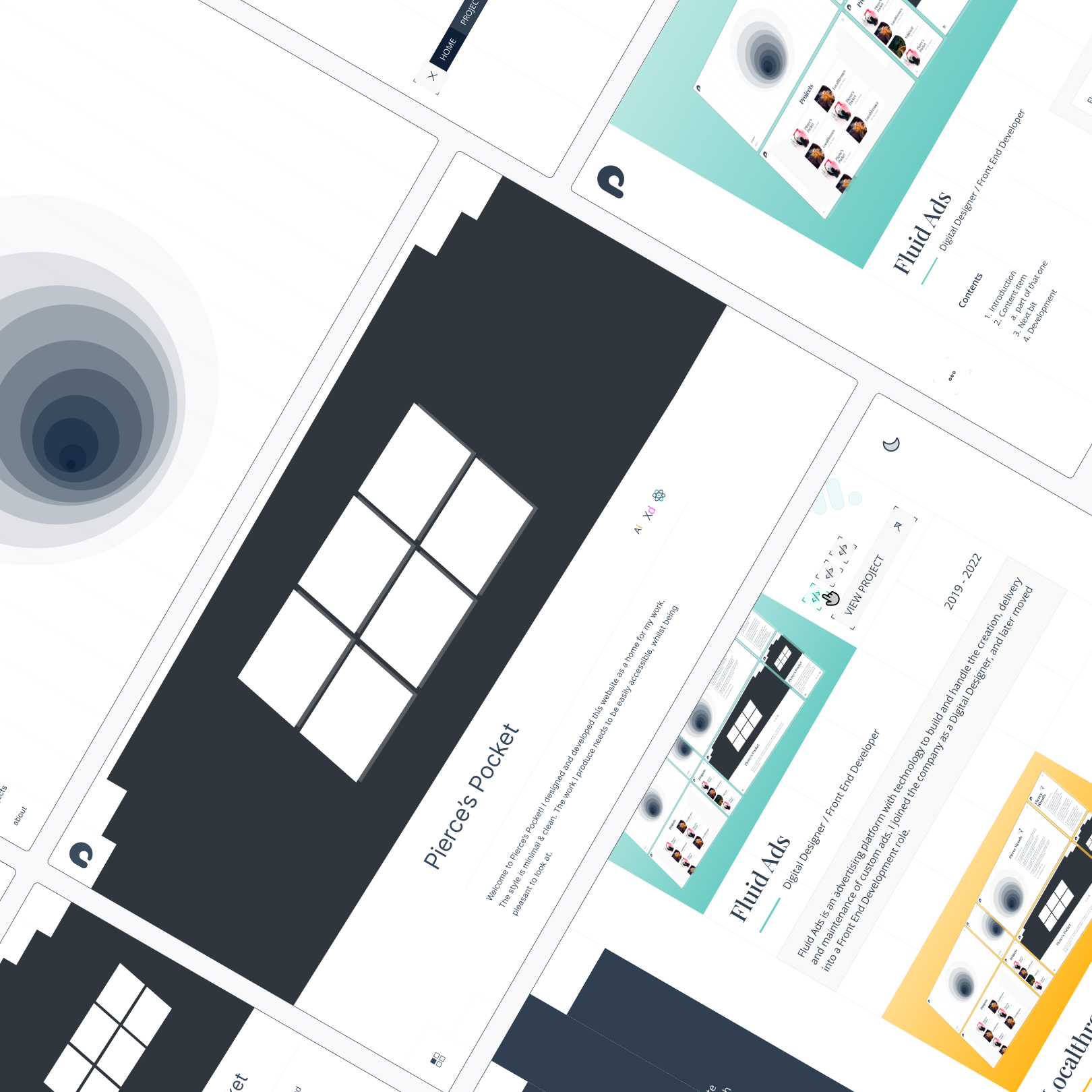
This project has been in the works for a while, meeting multiple iterations. Each iteration added a new element that would be carried forwards into the final design.
Current Implementation
For the final design I opted with a simple and clean look. The monochromatic aesthetic leaves a minimalistic feel, allowing for projects and other accents to draw focus.
The final implementation turned out like the final design looks (with some slight adjustments here and there), so feel free to explore this website to see!
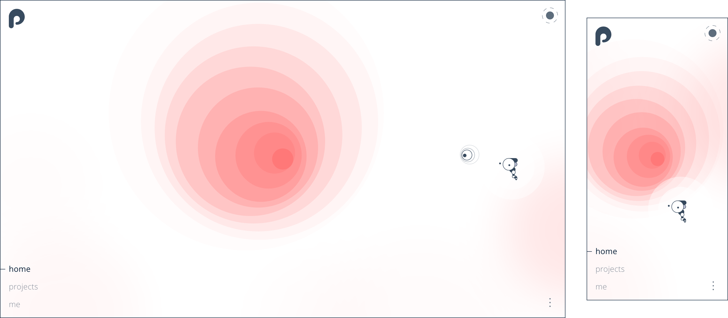
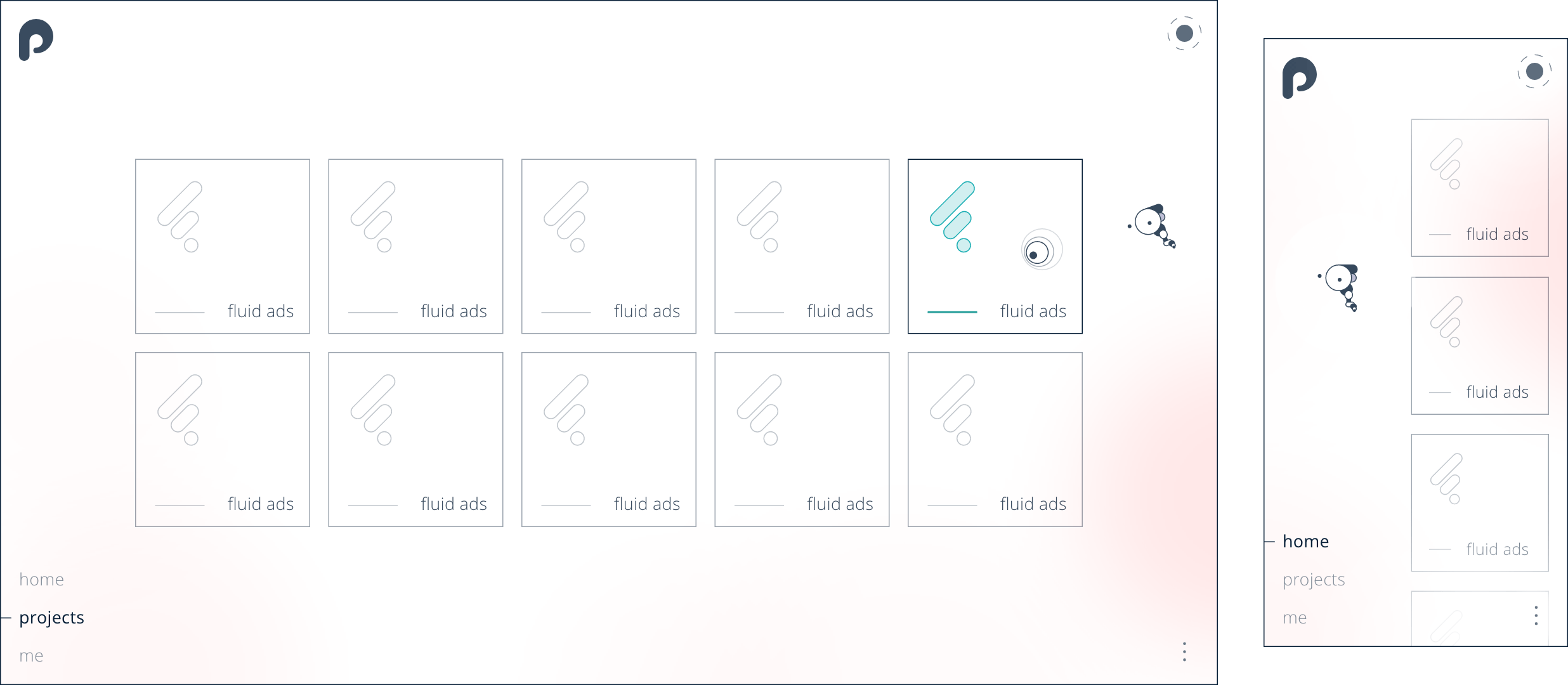
Future Design
The design below has been completed this year (2024). As my ux abilities has increased over time, my original vision for this project has been able to materialise more and more.
I'm sure this project will continuously been under construction, but these new designs feel more aligned to what I had initially invisioned for this project.
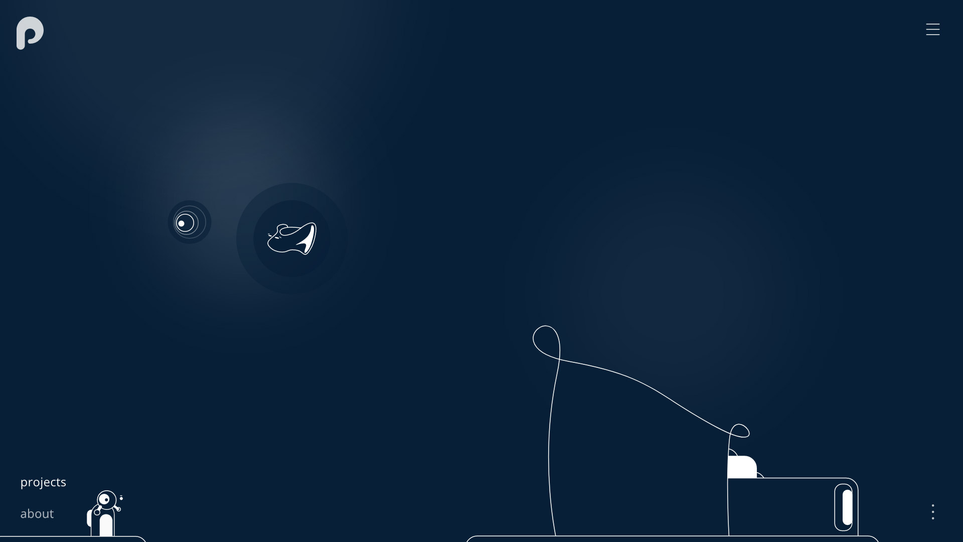
Development
I developed the app with React and Typescript, using Sass for styling. Using components allows projects to be loaded dynamically. I used a separate file for adding project content, and the Project component will loop through the project array to dynamically generate content on the fly.
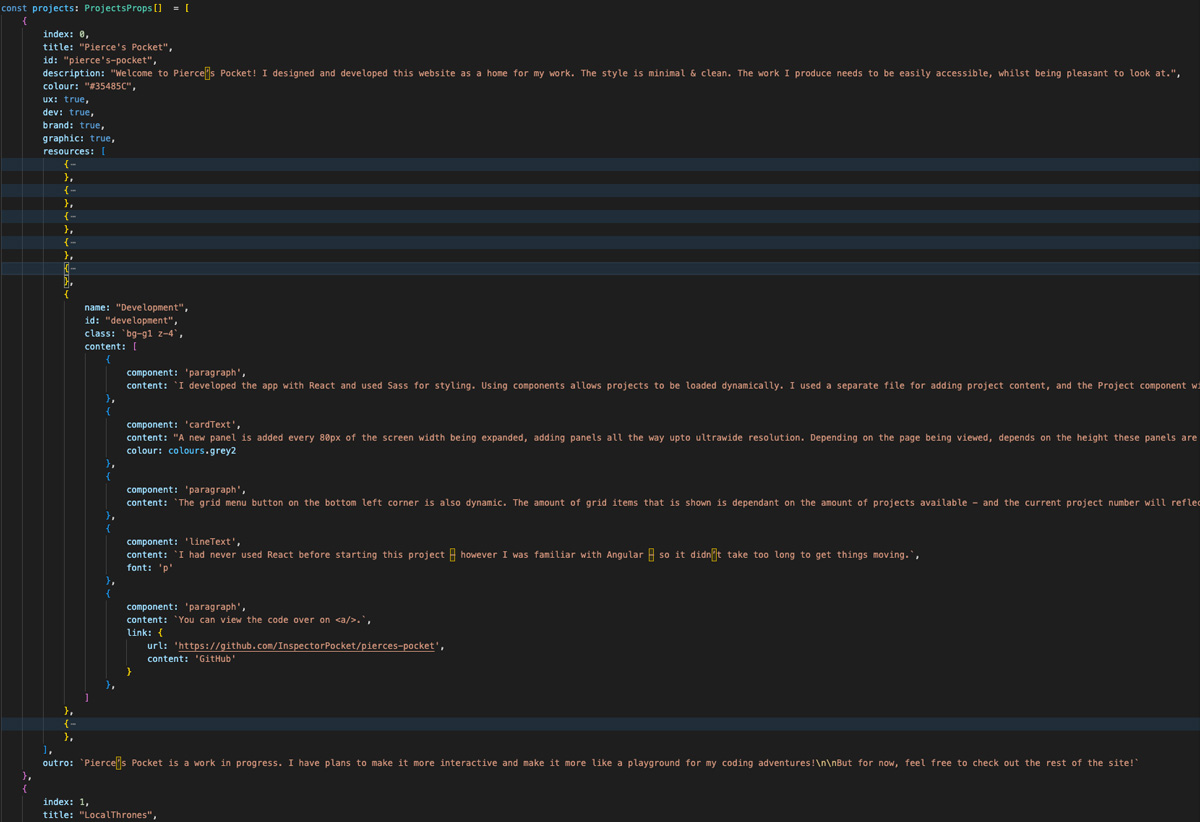
A new panel is added every 80px of the screen width being expanded, adding panels all the way upto ultrawide resolution. Depending on the page being viewed, depends on the height these panels are set. For example, the page you are viewing now closes most of the panels, but leave some open for the menu buttons to be navigatable.
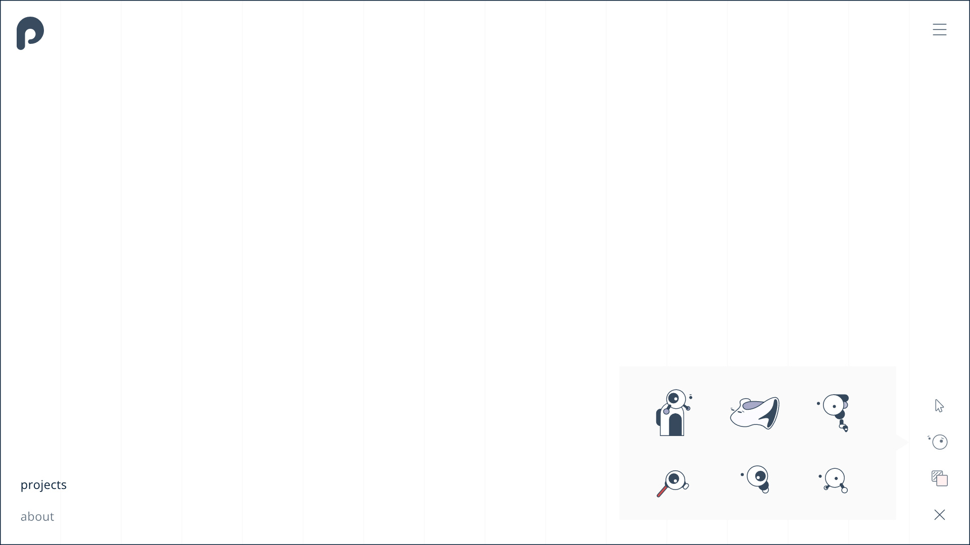
The grid menu button on the bottom left corner is also dynamic. The amount of grid items that is shown is dependant on the amount of projects available - and the current project number will reflect the active state of the grid.
I had never used React before starting this project – however I was familiar with Angular – so it didn’t take too long to get things moving.
You can view the code over on GitHub.
Extra Ideas
Some ideas didn't make it to the current implimentation, however they remain on the back burner and will be implemented later.
For example, I want to add the option to choose a certain theme that will carry through the website. Like dark mode, but introduces background designs and specific colours, carefully chosen to compliment each other.
Once I add a custom cursor to the site, the idea was to add fun little characters that can either follow the cursor around - or just be interactable. Scattering these illustrations around the site would add some unique personality, and could even be themed with the project being viewed.
The next step was to add a menu bar that allowed for cursor and character customisation - soley for the fun of it!
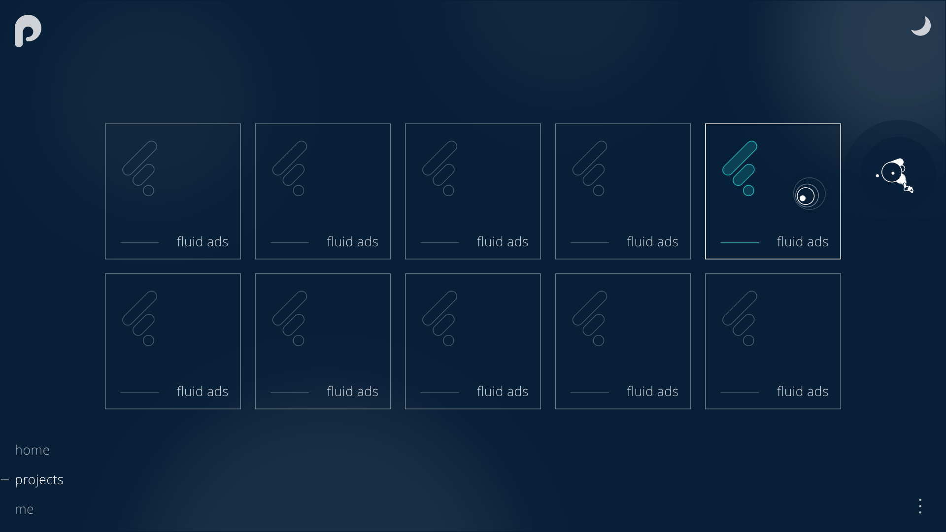
Projects
Fuelius
UX / Brand / GD
Cosmic Architect
UX / Brand / GD
Pierce's Pocket
UX / Dev / Brand / GD
North Property Group
UX / Dev / Brand / GD
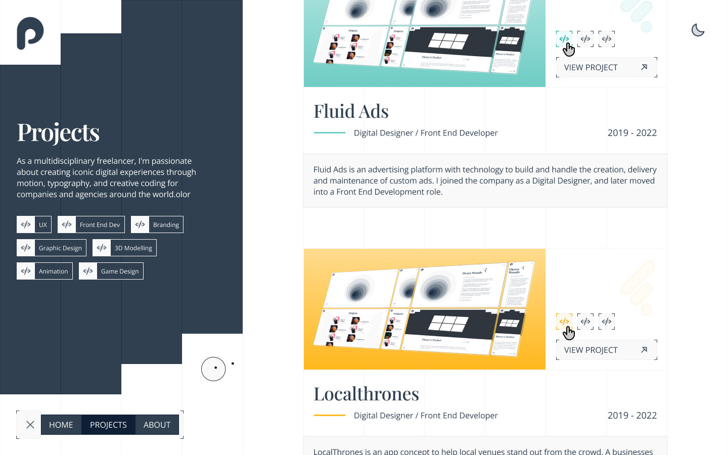
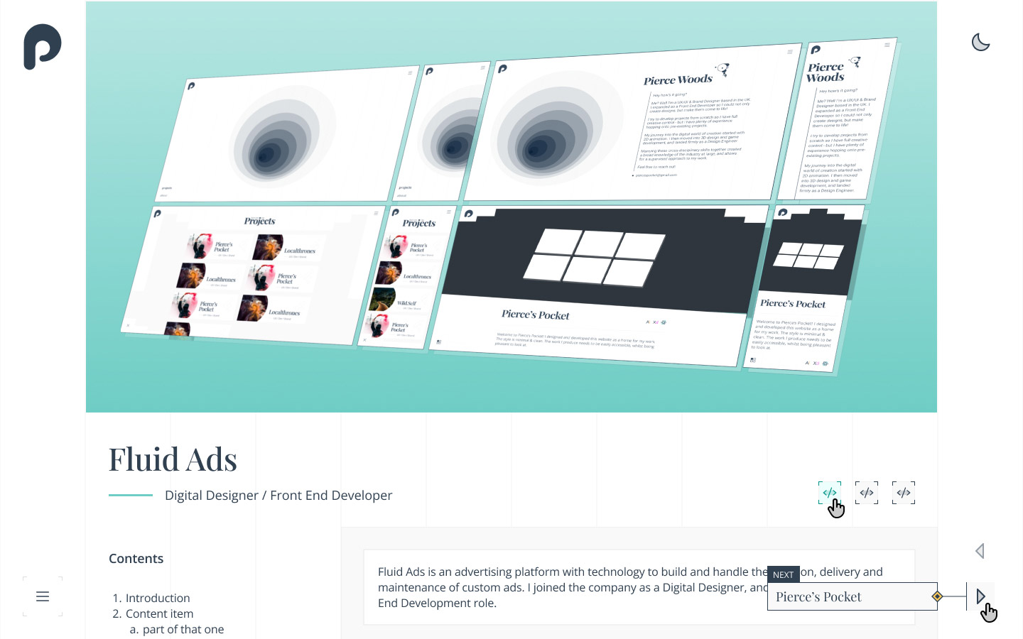
Fluid Ads
UX / Dev / GD
LocalThrones
UX
Clear UK
UX / Brand
Codedump
UX / Brand
Rozafa
UX / Brand
Logos
Brand / GD
Illustrations & Drawings
Brand / GD
Animations
Dev / Brand / GD
3D Modelling
GD / 3D