Cosmic Architect
Cosmic Architect is an in progress branding personality for the future projects I would like to work on in my spare time.
Brand
The brand consists of palettes across the entire colour spectrum. Each set of colours will come together in different ways to create new and interesting forms depending on the topic being discussed. Each form indicates a different branch of the umbrella ‘Cosmic Architect‘ brand.
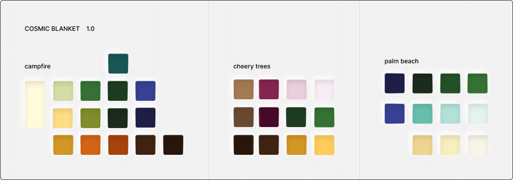
Colour Palette
The colours are chosen by me, by hand. Each of the colours are laid out next to each other and are carefully crafted to compliment the colours around each. This process involved tweaking not only the lightness and saturation colour values, but the hues as well.
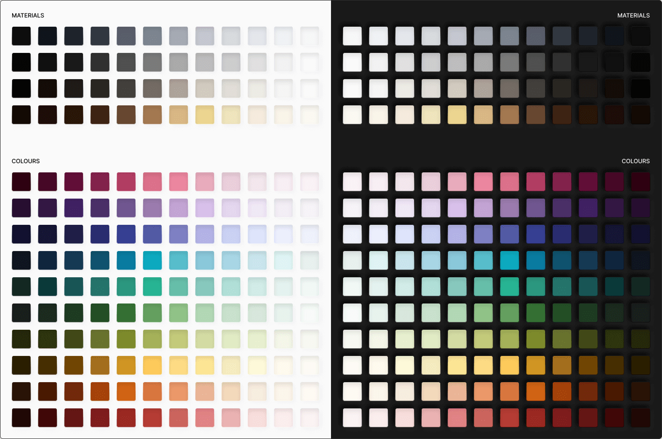
Material Palette
Each of the colour themes will sit a top of a material, that helps tune the feeling of the over all theme. Different tones of base monochrome, that form the foundation for all the brand applications. This includes borders, backgrounds and other elements that make up the foundations.
This could be a cooler theme on top of a steel grey material:
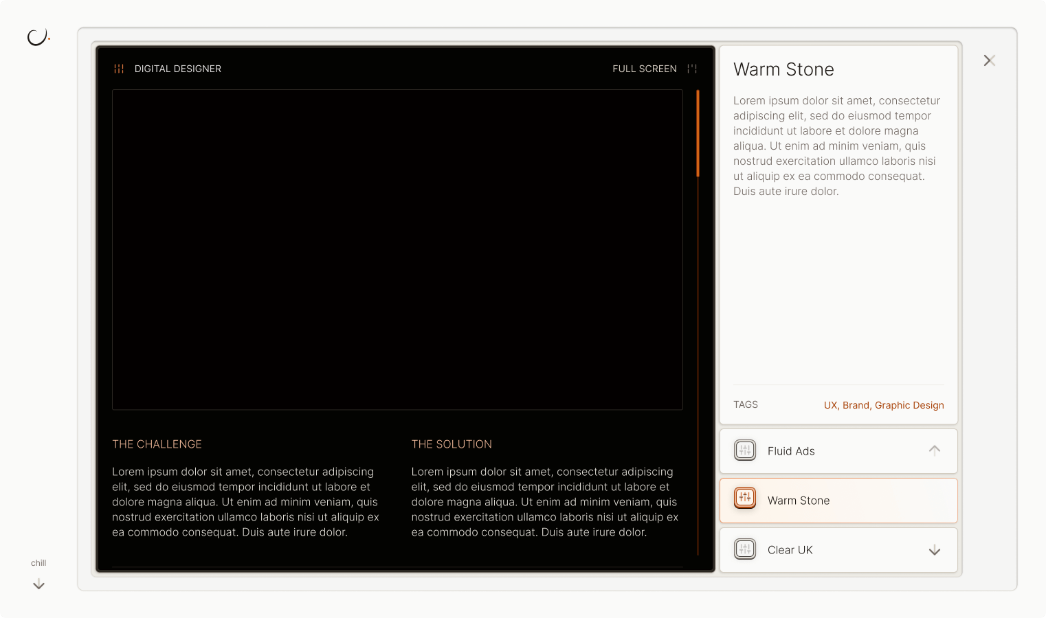
Or a warmer colour palette on top of a stone grey material:
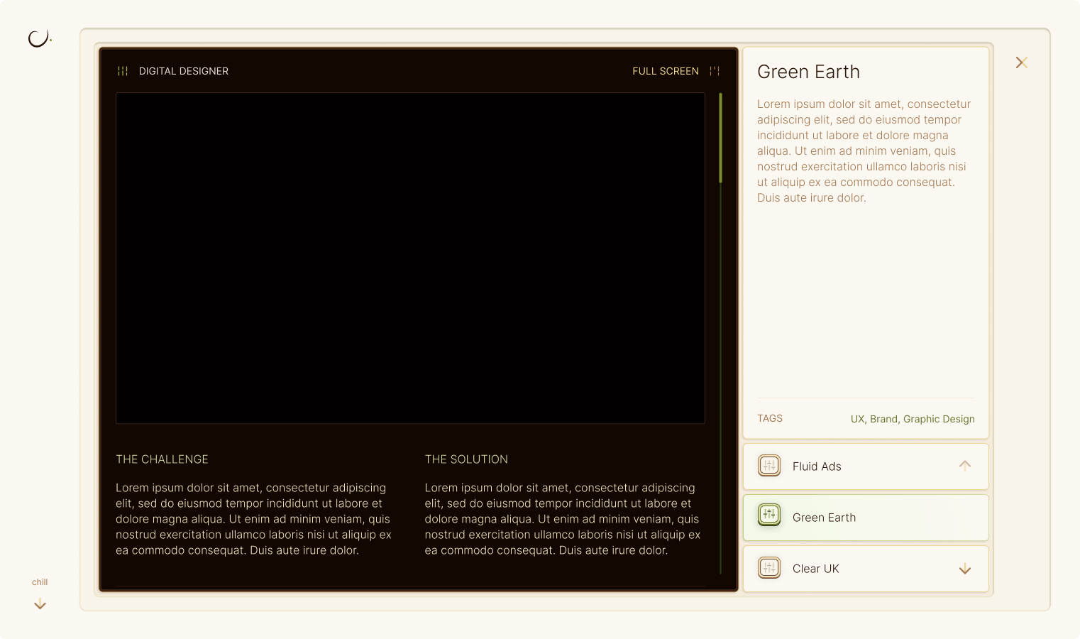
Or even a green colour palette on top of a wood like material:
All colours and materials can be switched around at will using the design system I have set up for this file.
Careful Colour Application
Human biological development is closely tied to colour, and colours have very powerful effects on our psyche. We can have different emotional reactions to seeing a red vs a yellow car. We can sense a company is more organic or health focused if their colour palettes are green. Or we feel more trusting towards a company that is blue (this is why most social media companies are blue!).
Colour theory is studied deeply in UX design, so I wanted to have a broad spectrum of colours available to help craft certain characters & narratives, as well as help illicit certain feelings depending on what topic or story I want to explore.
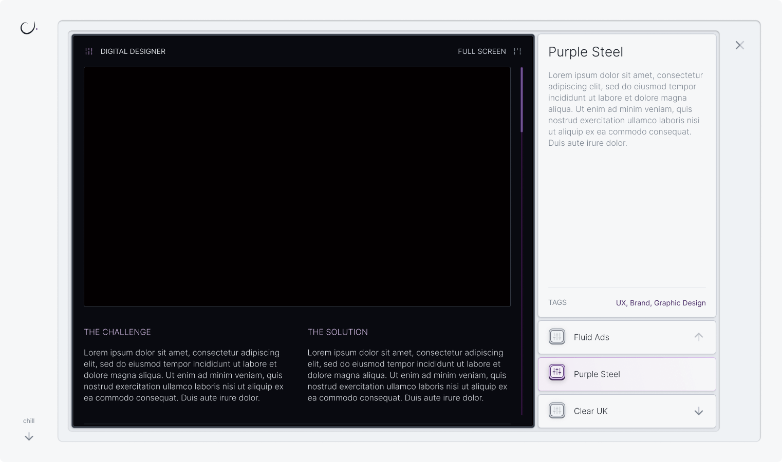
Colours will be able to mix together to create certain themes - allowing for an infinite combination of colour schemes to be created for each purpose. A few examples can be seen below:
Portfolio 2.0 Application
As you can see from the section above, I have begin testing and experimenting with these colours on a newer version of my portfolio. This version has the designs ready and is currently under development.
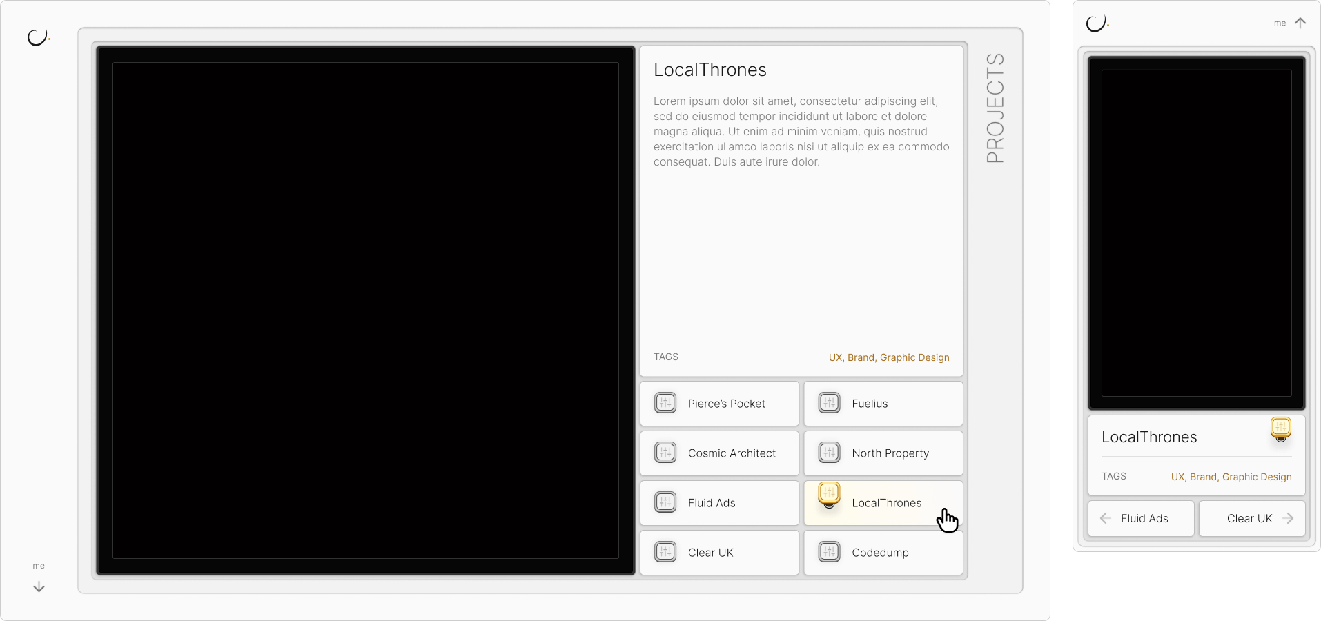

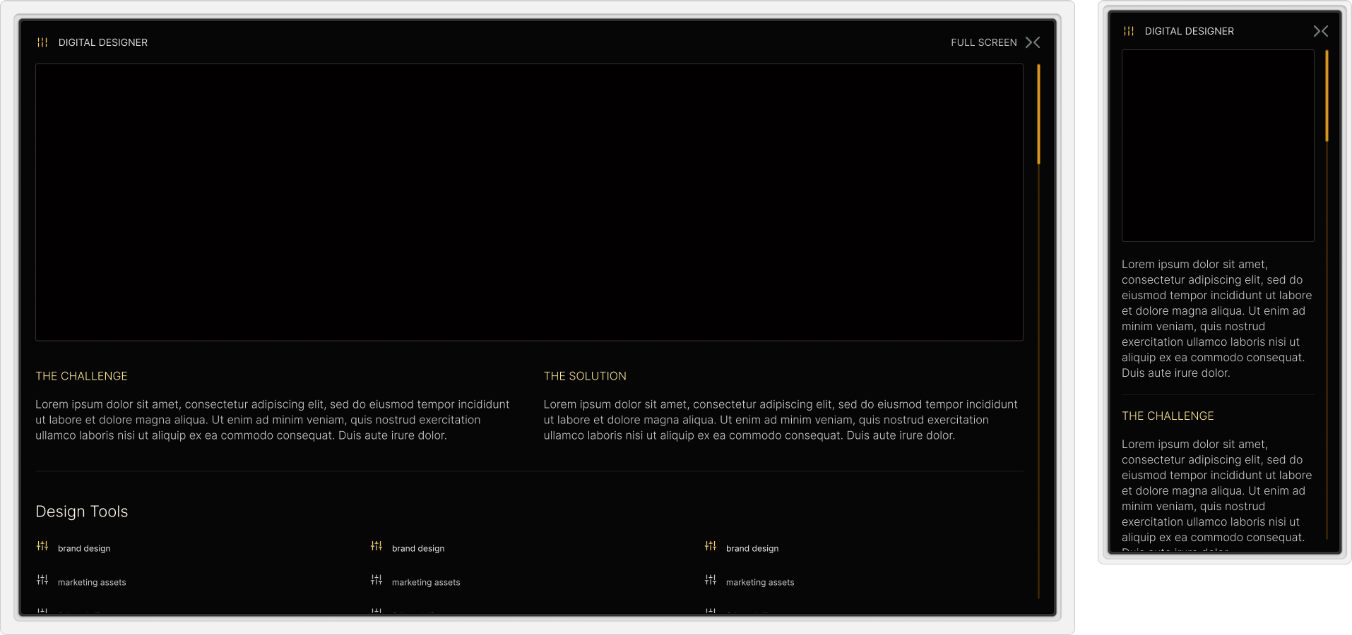
The main deviation from the brand (as laid out above) is that the colours in the portfolio are tied to specific projects, rather than topics. This is the current theme as of the current website you are viewing, so I’m transferring the colouring system from this version over to the 2.0 version.
App Research
I have plans to develop an application. The Cosmic Architect app will be designed to help show people easily understandable and digestible tools to help uncover the shadows within and face them without fear.
The Cosmic Blanket branch of the app, as mentioned above, is meant to be a safe area people can journal, find meditations, play healing music and ask deep questions about themselves.
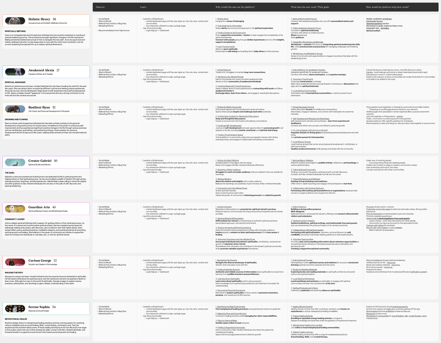
This is still under heavy conceptualisation and planning, however I have conducted some user research worth sharing. I am fortunate enough to be part of a spiritual community that was more than willing to help guide the direction of this from a potential users perspective:
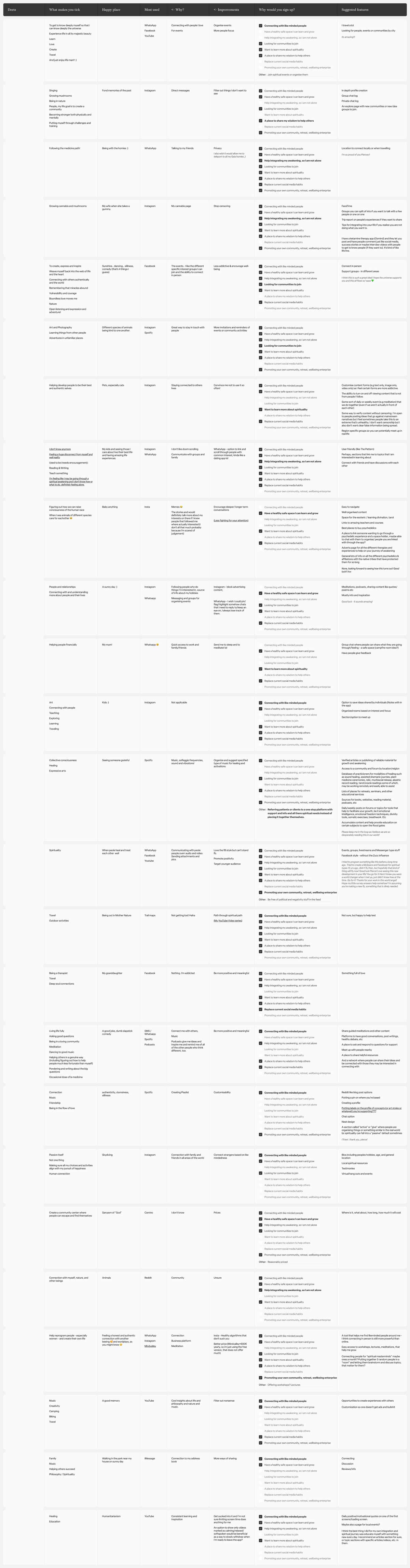
Collating all this data took a little while, but it has been extremely useful in creating user personas and user flows:
.png)
With plenty of detail:
.jpg)