Rozafa
Rozafa was the first potential client of a freelance business, me and some friends were going to start. Rozafa was part of a pitch to show what the branding company was capable of - designing and handling your brand and website.
User Journey
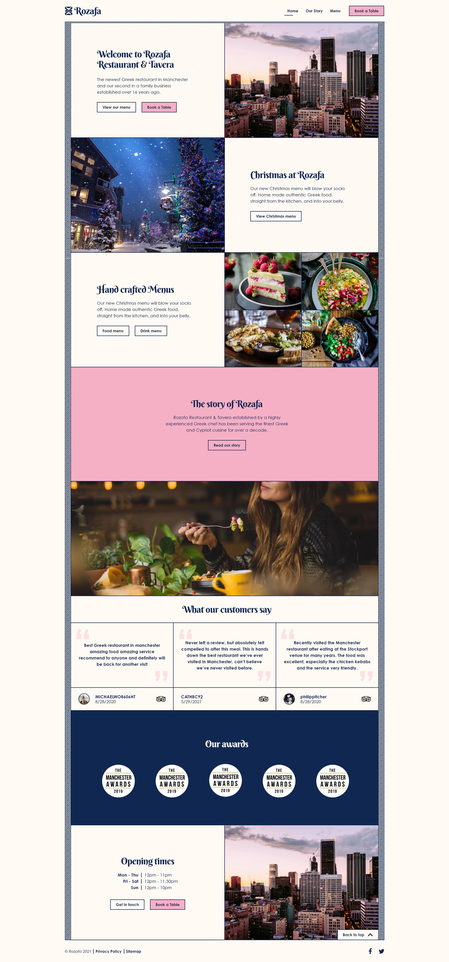
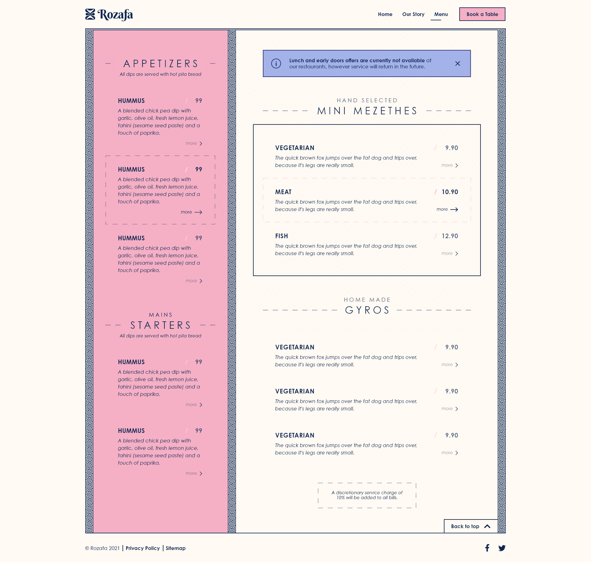
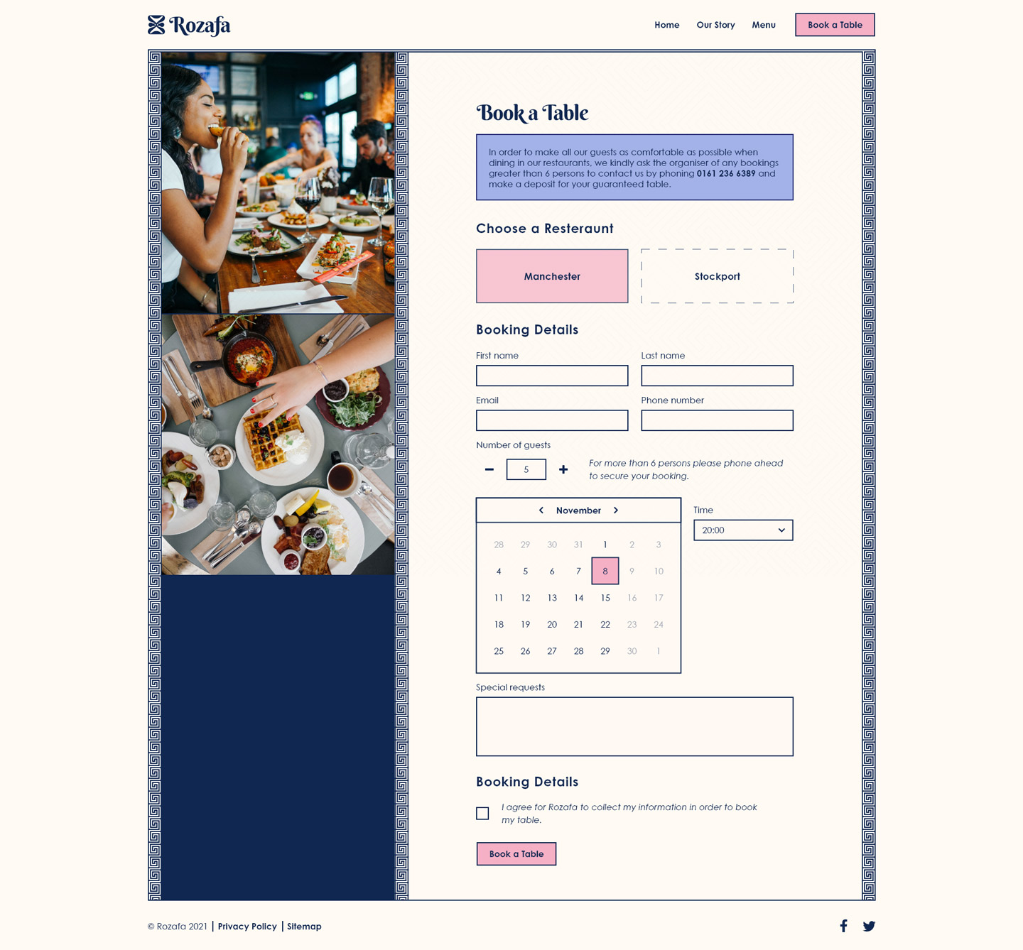
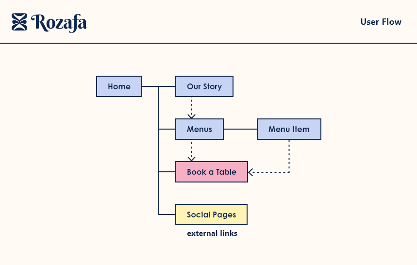
The flow of the website was straight forward. The goal of the user is to have customers book a table. Showing deals on the home page and allowing easy navigation to an interactive menu page - and details for each - was the primary step in achieving the users goal.
Styleguide
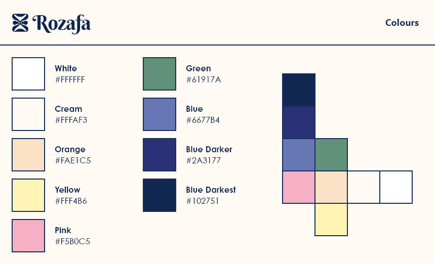
The colours I opted with were based on a quick browse on Dribbble to see some greek themed inspiration. The pink and the blue colour works nicely together, and the dark blue font style meets all accessibility requirements with the colours I chose.
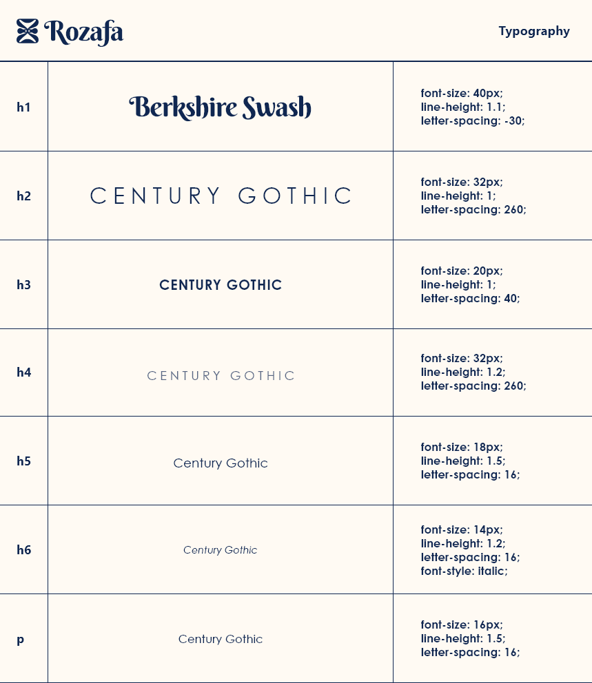
I chose Berkshire Squash as the font for the heading, to bring a exotic feel to the site. The main font is Century Gothic - a complimentary font to the headings.
I used the traditional Greek key pattern to have as borders for the content. The same symbol is used in the background at a reduced opacity. You can see this in the next section.
Design
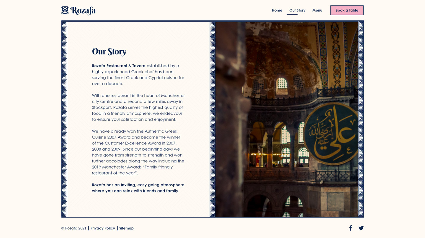
The design follows a standard layout of either a full width content block, or split into the necessary number of components. For example; 50:50 for text/content and 33:33:33 for testimonials.
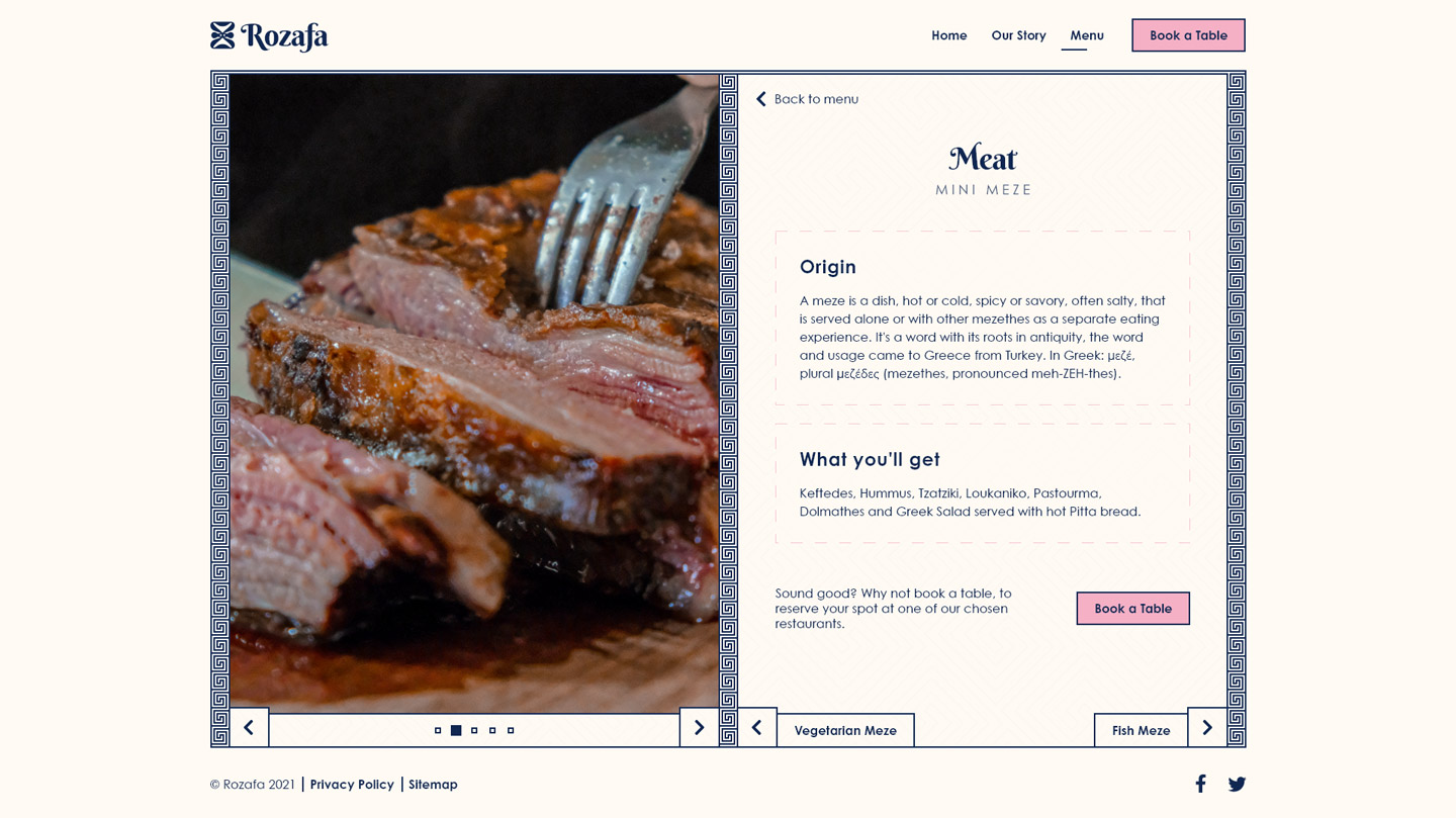
The menu page is interactive and leads to a more detailed view of an item - giving the company choice to add pictures, lore for the dishes or simply ingredients.
You can view and interact with the Adobe XD flow prototype I created using this link here. Or see the final screens presented below.